Sunday, January 27, 2008

Editions of Mayakovsky by Grafik Archive Publishing


In this day and age with advances in digital printing and print-on-demand technologies, it is possible to design and upload a book to a printing company’s server and have the book arrive on your doorstep a few days later. What amazes me is that the systems that create these books are so automated that they print, bind, and probably even box and ship without the book being touched by human hands.

It is easy to forget the days before computers when a book’s type was set by hand, letter by letter, and it took several days for a very small run to pass through the press. One book that I recently discovered whilst pursuing my love of Russian design is a modern title that was entirely printed using those older technologies involved in letterpress production. Book Design of the Russian Avant-Garde: Editions of Mayakovsky published by Grafik Archive Publishing in 1999 is so beautifully made that it makes me wish that it was still practical to turn off the computer and handcraft books for larger audiences.

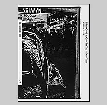
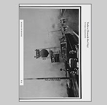
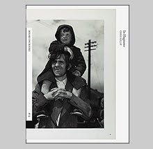
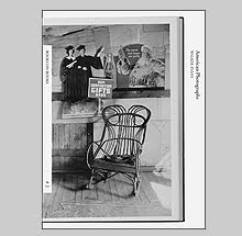
According to the publisher Lance Barton, Editions of Mayakovsky is homage to both letterpress printing and to the extraordinary design that was challenging the limits of that technology to meet the aesthetic demands of the designers. This book reproduces 45 cover designs from Vladimir Mayakovsky’s books of poetry and plays from 1917 to 1930 including two posthumous volumes of published conversations called Mayakovsky Alive.

Mayakovsky himself designed several of his own covers to remarkable effect. Many of the other well known designs were contributed by Alexander Rodchenko and El Lissitzky. Anton Lavinsky who designed the poster for Eisenstein’s Battleship Potemkin lent his talents to a few titles as well.

Much care was given to reproducing colors in Editions of Mayakovsky that would be faithful to the original material but since 80 years has passed since these books were published, a bit of artistic license has been taken in printing to determine what the color may have looked like fresh off the Soviet presses. Regardless, it is the way the ink lays on the paper - overlapping and at times slightly off register - that adds to the enjoyment.

The cover of this book is in simple black cloth with a wrap around band with Cyrillic lettering. The body of the book uses various paper stocks ranging from thin translucent to very thick cardstock. Interestingly, the publisher chose to bind using a fukuro-toji or pouch binding construction to the individual pages. This technique was developed in the fourteenth century because older Chinese and Japanese papers were so thin that printing on both sides was not possible. In order to avoid having blank pages within those older books, printers printed consecutive pages on only one side of a long sheet of paper and then upon folding the page in half and binding on the open end, the illusion is made that the paper was printed on both sides. The letterpress similarly would not have allowed printing on both sides of the paper due to the physical impressions made when the drum of the press passes the paper over the plate and amount of ink used unless a much thicker paper stock was chosen.

For the Voice, the groundbreaking book collaboration between Mayakovsky and El Lissitzky which I have written about before is treated to a special addition of a sheet of perforated stamps showing the designs for twelve of the poems.

Grafik Archive printed 700 copies of Book Design of the Russian Avant-Garde: Editions of Mayakovsky, of which 500 were bound with wire and 200 are case bound in cloth. I have also heard that the special case bound edition comes with a clipping from one of the actual metal plates used in the printing and that the whole ordeal, if found new from the publisher, is wrapped in a letterpress poster of Mayakovsky. I found one of the case bound edition but my copy did not come with these special additional material. Then again, this only set me back $75.00 in mint condition versus the usual $200.00.

I am no technophobe, I love what is possible to achieve in design and printing using ultra-sophisticated computers and printing hardware but there is something lacking when a droplet of sweat can no longer fall directly onto the paper and leave a little reminder of the hands hovering above it. Through the impression of the letterpress, we see the physical evidence of decisions and craft - mind and hand.


Book Available Here (Editions of Mayakovsky)

Tuesday, January 22, 2008

Vagabond by Gaylord Oscar Herron


When a photobook enthusiast thinks of Oklahoma, Larry Clark's Tulsa naturally springs to mind. His photographs of his amphetamine fuelled friends living fast and dying young are hard to ignore - especially for 1971 - but a lesser known book was published in Tulsa a few years later that follows thoughtfully in those footsteps of rebellious spirit. Vagabond by Gaylord Oscar Herron is an artist book in semi-autobiographical mode containing photographs, paintings, prose and drawings from another unsettled youth from the Midwest.

Framing the book around passages from Genesis 4: 1-16 and the story of Cain and Abel, Herron dedicates the book to Cain (and to Bill Rabon, another Tulsa artist). Herron seems torn between the roots of his family in Oklahoma and his desire, perhaps like Cain, to wander the earth. Much space is given to heartfelt love and respect for the older generations and traditions while balancing a need to see himself as separate, critical and different. This is a book that is partially about the growing divide between younger and older generations and how Herron's view of the stewardship of the world spurs his rebellion.

Mine is a generation of Cain...A restless generation of sleeping gypsies...Vagabonds of the spirit with an aged lion as a shield.
Mine is a generation lost in the land of Nod...Nuclear children who inherited Cain and who just now begin to wake from a dream.
Mine is a generation between the silent womanhood of Eve, and the woman who begins to understand she's been carrying Cain and his mark in her womb, delivering him painfully again and again, to a God-damning world created by men who thought they were doing the right thing.
Her anger reflects the enmity between her gift and what she's been given in return.
Mine is a generation between children seen and children loudly heard.
Their anger reflects as well the enmity between their gift and what they've been given in return.
Mine is a generation that disposed of God and replaced him with nuclear energy and the temptation to clone.
Mine is a generation of vagabonds, who just now begin to wake from the dream.
Mine is a generation poised on the threshold of losing the mark of Cain.

Interestingly, war figures into Herron's narrative but not the obvious conflict of Vietnam. Herron served as an MP in Korea in the early 1960's spending a lot of time on R&R in nearby Japan. As a boy, war shaped some of his early memories.

When I was three, I remember being called outside to see the soft Tulsa sky being sliced by an armada of growling prop planes.
East to West, ace-hole to elbow, like maddened locusts, they covered half the yard in menacing high-speed shadow; I watched bewildered.
"Where are they going?" I asked.
"To the war," said my mother...
"To Hirohito's house," said my father.

Herron weaves his personal history through disparate photographs of different formats and other media that challenge the traditional photobook. This book sits comfortably next to Clark's Tulsa and Teenage Lust and Danny Seymour's A Loud Song in that respect with their unabashedly playful designs mixing text and image. (At one point, the content of Vagabond is tenuously wed to Clark's Teenage Lust as Herron photographs in the same prison in McAlester, Oklahoma where Clark would later serve time the same year this book was published.) More than those other titles, Vagabond is not easily identifiable as a photobook with its covers depicting reproductions of Herron's paintings. The title and author credit appear only on the spine.

Published by Penumbra in 1975, Vagabond was printed by Sidney Rapoport in New York who was a well known printer who developed a process called Stonetone printing. His press was responsible for printing the 1969 edition of The Americans, The Destruction of Lower Manhattan, the Diane Arbus monograph, Looking at Photographs and others.

For as much as I like the book Tulsa for its honest portrayal of a dangerous and marginal lifestyle, I equally like Herron's tone of a marginal character expressing acceptance of himself, his history and his place within a world where the familiar and strange sit in close relation.


Book Available Here (Vagabond)

Friday, January 18, 2008

802 Photobooks from the M+M Auer Collection


How many great photo books would you guess have been published so far? Between Parr/Badger, Roth 101 and Open Book there are about 500 books featured collectively, but how many more were overlooked, unknown, or met the editing axe due to subjectivity? One thousand?

A new book called 802 Photobooks from the M + M Auer Collection brings a few more obscure titles to light. Michele and Michel Auer have over 20,000 photo books in their personal library and this selection of 802 is meant to show the variety of choice available above and beyond the other books of photobooks.

When I heard of this book, my first thought was “802 books? Great…the more the merrier, time to give the ABE search engines a workout” but upon seeing a copy, I am starting to think that after 500, there is a big drop off from the look of things.

I have to say from the look of things because one of the biggest drawbacks to this book is that it provides no information about the content other than a thumbnail photograph of the cover or a spread, the physical size and publishing info. So this is a judge from the cover, do your own research approach that may have you spending money simply due to a book’s cover image.

802 Photobooks is very small at only four by six inches but the two inches worth of pages gives it a decent heft. The printing is adequate even though the images are not much bigger than 35mm contacts.

Don’t get me wrong, I enjoy looking through this as much as many of the other books on photo books but I really do not see much of a point without the educational benefit of descriptions of the content. This may be the closest you get to porn for photobook geeks.

http://www.auerphotobooks.com

Buy online at Schaden.com

Wednesday, January 16, 2008

Recuerdo exhibition by Ed Grazda


This is to inform you all that one of my partners in crime, the photographer Ed Grazda, is having an exhibition of his work at Sepia International that will run from January 18th until March 1st.

Called Recuerdo: A Memory of Latin America 1972 - 1979, the exhibition offers over 50 vintage prints of mostly never before seen photographs in this large one-man show. An opening reception is on January 17th from 6-8 pm. Sepia International is located in New York City at 148 West 24th Street (between 6th and 7th Avenues) on the 11th Floor.

Born in New York City in 1947, Edward Grazda studied photography at the Rhode Island School of Design. Starting in 1972, he began photographing in Latin America. Later he concentrated on Asia, traveling to Hong Kong, China, Thailand, Burma, Pakistan, and India. During the past twenty years his primary focus has been on the people of Afghanistan. Grazda teaches photography at the Harvard University Summer School and is on the faculty of the International Center of Photography in New York. He has worked on the archives of Walker Evans and Hans Namuth.

The subject of three monographs, Grazda's work has also been published in The New Yorker, Vanity Fair, Doubletake, The Christian Science Monitor, and Avenda-E-Afghan, an independent Afghan newspaper. His photographs are in the collections of The Museum of Modern Art, New York; The Metropolitan Museum of Art, New York; The Brooklyn Museum of Art; The New York Public Library; The Corcoran Gallery of Art, Washington, DC; The San Francisco Museum of Modern Art; and others. Among his awards are grants by the National Endowment for the Arts in 1980 and 1986, and by the New York Foundation for the Arts in 1986. He has been a MacDowell Colony Fellow in 1994, 1996, 1999, 2001, and 2003.

Manhattan Noon exhibition by Gus Powell


All of my friends are successful!

Gus Powell is also enjoying a one-man show of his work at the Museum of the City of New York. Called Manhattan Noon: Photographs by Gus Powell, it is on view until March 16th.

The midday meanderings of New Yorkers on their lunch breaks, famously captured by Frank O'Hara in his 1964 collection Lunch Poems, are the subject of Manhattan Noon, the first large-scale New York presentation of the recent photographs of Gus Powell. The exhibition features some 30 color images, taken by Powell during his lunch hour, that capture the city's inhabitants in, as O'Hara wrote, "the noisy splintered glare of a Manhattan noon."

In the mid 1950's Frank O'Hara wrote a book called Lunch Poems. Each day he would step out of his mid-town office, walk his way to the Olivetti typewriter showroom, and bang out a poem about “the noisy splintered glare of a Manhattan noon.” For the past few years I have worked behind a desk not far from where O'Hara once sat. After I was given O'Hara's book my lunch breaks started to get longer. Sliding out of the revolving door I found myself transformed into a hungry sailor with one hour of liberty from his ship. Some days the sidewalk offered a dramatic or romantic one act play; a pedestrian might fall, a couple might kiss . . . but most of the time I was looking at people who walked towards and away from me. The quiet gestures of strangers in daylight became significant, and the photographs I made became my lunch pictures. -Gus Powell

Gus Powell was born in New York and currently lives in Brooklyn. Gus's photographs have been exhibited at the Art Institute of Chicago, the McMullen Museum of Art, Boston, MoMA NY, and other national and international galleries. His fine art and editorial work has appeared in The New Yorker, DoubleTake, Newsweek, and the book Bystander: A History of Street Photography. In 2003 Gus was included in Photo District News' "New Talent" issue and his first monograph, titled The Company of Strangers, was published by J&L Books.

Buy Company of Strangers online at J+L Books

Monday, January 14, 2008

The Forgotten Village by Alexander Hackensmid


There are many books that I own and enjoy immensely but have trouble finding something interesting to write about besides giving simple praise and a recommendation. Sometimes, with a little digging and research, I come up with an angle that sparks waves of inspiration to write and other times, I give up and save you some pocket money. Recently I was just about to give up on one such title when I uncovered a whole host of interesting little facts that connect the dots with some history and unexpectedly provides a view of photography within the larger canopy of another artistic medium.

This unexpected treasure is a small book called The Forgotten Village published by the Viking Press in May of 1941. Originally a film of the same name directed by Herbert Kline and written by John Steinbeck, The Forgotten Village book is 136 film stills accompanied by Steinbeck’s text narration.

The story is rather simple: in a small Mexican village named Santiago, children are getting ill from contaminated well water and a young man, named Juan Diego, ventures to Mexico City to seek help from doctors and scientists. Upon testing the well water, the doctors discover parasites are the cause of the illnesses and a struggle between the traditional healing beliefs of the village elders and modern science takes place. Siding with the scientists, Juan Diego is subsequently banished from the village where he then he makes his way back to the Mexico City to study medicine and help modernize traditional thinking. “The change will come, is coming, as surely as there are thousands of Juan Diegos in the villages of Mexico.” And the boy said, “I am Juan Diego.” Cue dramatic music. The End.

The film was apparently made in semi-documentary style using real villagers as characters that “act out” the filmmaker’s message about a real problem afflicting many rural villages. Although I have not seen the film, I imagine it being comparable to Eisenstein’s Que Viva Mexico shot in the early 1930’s with a similar semi-documentary approach.

What makes the book for The Forgotten Village so interesting for me is the quality of the photography. The book is comprised of “stills” from the film (I do not know if they are individual frames taken directly from the movie film stock or, as is common with set photographers, the photos are made in the approximate sightline of the movie camera) but there are many images that stand so strongly on their own they transcend being a part of the greater film.

That quality of the images made me look to who the director of photography was on the picture and it turns out to have been Alexander Hackensmid. Hackensmid, whose name has many different spellings, was one of the leading avant-garde photographers and filmmakers in Czechoslovakia in the 1930’s. He later changed his last name to Hammid and for five years he was married to the legendary filmmaker Maya Deren. He also won an academy award for Best Documentary Short in 1964 for a film called To Be Alive! which was made to be projected on three separate screens at the same time. His earliest film, Bezucelna Protozoa (Aimless Walk) can be seen on YouTube.

As if that wasn’t enough, I looked into the director of The Forgotten Village Herbert Kline’s background and that opened up a few other noteworthy associations. In the 1930’s, Kline was a part of the New York Film and Photo League which in 1936 divided to form the Photo League that we normally associate with the likes of Weegee, Aaron Siskind, Sid Grossman, Morris Engel, Dan Weiner among many others.

He was one of the first Americans to go to Spain during the Spanish Civil War where he made a couple of documentaries, one called Heart of Spain in 1936 and one a year later called Return to Life which he co-directed with none other than Henri Cartier-Bresson. Oh…and almost forgot, Heart of Spain was edited by Paul Strand.

And one last tidbit to bring things into the modern age for all of us youngsters, in 1940, Kline directed a documentary about World War II called Lights out in Europe and a young twenty-seven year old Douglas Slocombe worked as a second but unaccredited photographer. Slocombe would later be responsible for the cinematography on all three of Spielberg’s Indiana Jones films from the 1980’s. (He is also known for not once using a light meter in the shooting those films.)

Winding my way back to the actual subject at hand, besides the photography, The Forgotten Village book is constructed in an interesting way with continuous pairings of photographs across the page spreads. Many of these pairings have their own wonderful dynamics in their design and narrative flow. That, and the fact that the book is printed in gravure on a thick paper stock that has a nice tooth to it, giving it a slightly speckled flavor.

It is interesting to me how I process the images in this book as well. Knowing that they are individual photos pulled from continuous flow of 24 frames per second, it is often difficult to see them as still photos - as incomprehensible as that may sound - yet it is that stillness that is the seduction. It does take a certain mindset to fully detach this book from its projected counterpart.

The Forgotten Village is available cheap from several sources. Personally I wouldn’t spend more than $15-20 dollars but it is very well worth taking a look. For those interested in folks like Pierre Verger, whom I have written about before, will probably not be disappointed.

There is one other book that I own called M, La Maudit which is currently in cold storage (so I cannot share it with you right now) in the 5B4 Whiskets Center for the Understanding of Compulsive Behavior Research Library Storage Facility in Medford, New Jersey. M, La Maudit is a collection of film stills from Fritz Lang’s masterwork M. I bought this book in Paris on the strength of the individual “stills” as distinctive photographs separable from the film. Of course, that strength laid in the hands (or eye) of Fritz Arno Wagner who was responsible for the photography on not only M but Testament of Dr. Mabuse and G.W. Pabst’s Three Penny Opera and Kameradshaft and…

goddamn the internet…

Book Available Here (The Forgotten Village)

Sunday, January 13, 2008

William Kentridge Prints and Cyclopedia of Drawing


Since there is a William Kentridge show opening at the Marion Goodman Gallery in New York City next Wednesday I thought I’d share two books that have been recent additions to my collection.

Kentridge, as most of you know, is one of the most world renowned artists working in South Africa today. I first saw his animated film Stereoscope when it was featured in MoMA’s Projects series and within just a few seconds of that 8.5 minute short, I was hooked. Unlike traditional animation that utilizes thousands of individual cells drawn and photographed one at a time to create the illusion of movement, Kentridge uses the same piece of paper and erases and redraws the slight variations in between the camera frames. The result leaves the smudges and faint history of the entire scene recorded while the image continues with the narrative. History and its inconvenient way of lingering and tainting is one of the many layers at play in Kentridge’s work.

He has created drawings, films, sculpture, prints using many techniques, puppet theater pieces and even produced a staging of Mozart’s The Magic Flute which had its American debut at the Brooklyn Academy of Music last year. A major show of his tapestries is currently on view at the Philadelphia Museum of Art through April 6th.

There have been several handsome books and catalogs published but one of note from 2006 is William Kentridge Prints from David Krut Publishing. This is the first book dedicated entirely to Kentridge’s thirty year history with printmaking.

The book is illustrated with over 180 reproductions starting with his earliest linocuts from 1976 when he was just out of high school to his 2005 Receiver series which are photogravure printed on handmade paper. Each series or edition featured is accompanied by a short text written by Kentridge that gives insight into his process and ideas. Looking through this book, it is the variety of ways that Kentridge has used the printed form that is a surprise.

It seems much care was taken in producing a quality and tone that is faithful to the original works as the reproductions are very good. Susan Stewart contributes a fine essay at the beginning of the book called Resistance and Ground: The Prints of William Kentridge. The book is available in both hard and soft cover.


The second book I have recently acquired is more in the form of an artist book. Published in 2004 by Art3 and the Ecole d’Art d’Annecy in France, Cyclopedia of Drawing is a series of drawings by Kentridge that acts as a flipbook.

Using pages from an American Technical Society reference book published in 1924, Kentridge creates each cell of his animation over mechanical and architectural engravings used to illustrate the fabrication of sheet metal and tinsmith projects. Kentridge has often used existing printed material from encyclopedias, maps and charts, indexes to create foundations that reflect knowledge, history or metaphysics.

In Cyclopedia of Drawings, Kentridge’s alter ego Felix jumps into the air and quickly morphs into a bird taking flight. After his brief stint as Icarus, he somersaults back to the ground and ends in a relaxing, almost comic pose. On each page, the diagrams and formulations from the technical book seem to be ‘proving’ the possibility of this remarkable feat while at the same time the page headers of SHEET METAL WORK and TINSMITHING humorously mock with their connotations of home-made construction and physical weight.

This book was published in an edition of 1000 copies, 100 of which were signed and numbered. I know of at least one other flipbook that was published in 1999 which I have heard animates a nude Felix as he scoops water up in his hat. The animation is supposedly drawn over pages from a Catalan grammar course book. Both of these have become very rare and very difficult to find. Originally priced at 28 euros, Cyclopedia of Drawing is now usually a couple hundred dollars. It is soft cover and approximately 6 by 8 ¼ inches with a strip of black binder’s tape on the edge. The reproductions are well done on a creamy yellow heavy paper stock common to technical manuals which is edged in red.


David Krut Publishing

Book Available Here (William Kentridge Prints)

Saturday, January 12, 2008

The Stamp of Fantasy: The Visual Inventiveness of Photographic Postcards


One area of photography collecting that I have thankfully avoided is the world of photo postcards. Even with their hand tinted colors or exotic locals, it is always the endless possibility to find more at every turn through a dusty flea market that seems to me to be a bottomless pit of spending (much unlike photo books right?).

A few times I have been swayed. Once I found in a large box, several postcards on the subject of mining towns that had little cloth bags of ore attached to the card’s corner by a small length of string. At a quarter a piece, those were too good to pass up but admittedly, it was the tiny bag of ore and its contents that held my interest much more than the photo on the card.

Many books published in past years have featured collections of photographic postcards like Martin Parr’s Boring Postcards books or the older Prairie Fires and Paper Moons by Hal Morgan and Andreas Brown which looked at America through postcards made at the turn of the twentieth century. One recent addition to this genre is Steidl’s The Stamp of Fantasy: The Visual Inventiveness of Photographic Postcards.

The Stamp of Fantasy concentrates on examples of visual manipulations and inventive techniques that manufacturers and amateur photographers employed to create the ‘fantastic’ and surreal imagery that illustrated postcards throughout Europe in the early part of the century. Double exposure, montage, distorting optics, constructed studio sets and manipulation with pen, ink and paint all contributed surprise to this new mass-distributed medium.

Mostly meant for pure ocular pleasure, many of the examples reveal themselves (or the maker) to be somewhat disturbing in nature. In one 1905 example from an unknown amateur photographer in Germany, a man stands with his hands outstretched holding in his palms two plates, on each plate are copies of his disembodied head; all of which grin for the camera. The pages following have equally, if not more disturbing cards. One featuring a man whom, with bloodied knife in hand, holds up a decapitated head of another.

(Sorry for the interruption but all of this decapitation reminds me of two things that I need to mention; first, of hearing about a doctor named Beaurieux performing an experiment by shouting the name of a guillotined victim a few seconds after the head came to rest in the basket. He reported, “I then saw the eyelids slowly lift up…and the pupils focused themselves.” And secondly, anyone who hasn’t seen one of my favorite films of all time, Jiang Wen’s Devils on the Doorstep, will enjoy the results of the aforementioned experiment all the more when they see this film. I haven’t ruined anything for you by the way. Back to the book.)

Surprisingly out of the 345 illustrations I am drawn the most to a small series of postcards from 1903 from the Delarcade Editeur in Paris that straight forwardly depict items against a nondescript white backdrop. A pare, a broken woven basket, a man’s shaving razor and one that amounts to the most beautiful description of a man’s jacket I have ever seen. These were published under the series ‘Symboles’ and it is unclear to me as to what the deeper intent was in producing and labeling these cards under the heading of fantasy.

Other examples by Hannah Hoch, Man Ray, Paul Citroen and Marcel Duchamp show how these new forms of communication were adopted by the avant-garde artists of the time. Brassai, speaking about the appeal of fantasy postcards on the Surrealists said, “The poetry of postcards attracted them as much as the surprising arcades of Paris.” Like most people who collect passionately, some were so bitten by the postcard collecting bug that odd values were attributed to them. The poet Paul Eluard once confessed to promising Georges Sadoul a painting by Salvador Dali in exchange for 200 of his finest postcards.

Clement Cheroux ends The Stamp of Fantasy with a wonderful essay that traces the rise in popularity of photographic postcards and how that, along with roll films, assisted in altering the trajectory of the medium away from the professional studio photographers and into the hands of amateurs.

The book was published to accompany a traveling exhibition that opened at the Fotomuseum Winterthur last October. It breaks the subject down into three major categories: Publisher’s Postcards, Studio Postcards and Amateur Postcards. The book’s design is a little cold for my tastes but the production values and quality of the content make up for that.


One other book that takes on fantasy postcards as a subject but in a limited scale is Robert Lebeck’s Angeberpostkarten published in 1979 by Harenberg Kommunikation. This small paperback presents 80 of the finer examples from the collection of Robert Lebeck. Lebeck may be a familiar name for many as he was once a photojournalist who worked for Stern magazine for over thirty years. He also co-wrote the book Kiosk: A History of Photojournalism (Steidl) which I wrote about in a very early posting here at 5B4 and will be the subject of a three volume set called Tokyo/ Moscow/ Leopoldville this year from Steidl.

I bought Angeberpostkarten over 15 years ago and it is an enjoyable collection of what may be the more typical examples on the subject of fantasy postcards. Many plates are given to the ubiquitous images of super-sized farm animals grazing among Lilliputian humans and fisherman fighting to reel in trout that are as big as Jonah’s whale. The better examples are of cityscapes where the attitude of excitement towards new technologies pollutes the skyline with flying machines and buildings. They provide the visual surprise of impossible utopias that promise daily adventure even if it is a quick trip out for a loaf of bread.

This book was a part of the Die Bibliophilen Taschenbucher series and is number 115. It is has a nice feel to it with its decent paper stock and reproduction glued to the front cover. The reproductions are good.

Even after seeing how much variation there is to enjoy in postcard collecting, I’m sticking with books on the subject. In these two (and I am sure many others) we can see the finer examples of visual playmaking sent to bring cheer through photography and short passages of personal text. Little did we know that later these seemingly innocuous forms of communication would provide, in the words of Salvador Dali, “an experimental base for the study of modern and popular unconscious thought.”

Buy online at Steidlville

Book Available Here (Angeberpostkarten)

Thursday, January 10, 2008

Four from Farewell Books


When most young artists dream of publishing a photography book they may desire for it to be accepted into the hands of a Hatje Cantz, Aperture or Steidl. Often the dream entails lush production values and a care given that is tantamount to the respect one tends to place upon their own work.

On the other side of the coin, there are artists that have a DIY approach similar to the vast amounts of fanzines (’zines) that appeared throughout the heyday of the punk and hardcore music movements in the early 1980’s. ‘Zines are rather cheaply produced magazines of varying length, often Xeroxed and staple bound and distributed through various independent channels.

Many of these could be thought of as small rafts sent out into the world; many reached audiences, many sunk. Of the hundreds of thousands if not millions, few were saved for their seeming disposable nature and most were doomed to be recycled into toilet paper, but longevity was not the intended purpose, it was the immediacy of the message or voice.

Few ‘zines were professionally printed but with the recent advances in technology one can prepare their own booklets right from the home using a basic home computer and send the files off to a commercial printer that can print and bind a small run of somewhat professional looking books.

One such small publisher who is taking advantage of this type of low-fi production is called Farewell Books which is run by a photographer named Marten Lange in Sweden. Originally started to publish his own photography, he has branched out to publish others including the prominent photographer and conceptual artist John Divola. All of the books are various sizes; laser printed and perfect bound in soft cover.

Woodland is the first of the two titles of Marten’s work from Farewell. Published in 2007, Woodland is 40 square photographs of chaotic landscapes made within the brush and thickets of forests. The photography, if printed in duotone instead of laser print, might be in harmony with some of Lee Friedlander’s attempts at slashing through that same landscape but here the production adds its own interesting dose of spatial confusion.

This book seems to teeter between something that aims at being conceptual and something that wants to fall entirely into the long tradition of landscape photography. Unlike Ed Ruscha’s gas stations, this dense woodland seems to be too confined within familiar photographic traditions.


Marten’s second book however could be perceived as sitting further into conceptual territory than its predecessor. Machina, also published in 2007, is 34 square photographs of various machines from nanoscience and microtechnology labs in Sweden. Taken from a close distance, they are a tangle of wire and tube making up unfathomable devices that seem both friendly and threatening.

This book seems to have slightly better resolve in the printing than the Woodland book, which may be an illusion due to the clean and smooth line of each component that is illuminated by Lange’s even flash.

Although I think conceived as individual books meant to stand apart from one another, as a set, they create an interesting dichotomy. One body of work is made in an environment where everything visible is of the natural world and the other is made within a world where everything is synthetic.


The third book from Farewell is called Late Winter Early Spring by Magnus Gyllensten. This the largest in trim size of the four books at 8 by 10.5 (Woodland and Machina are both 6 by 8 inches) and it is a 19 photograph bit of stream of consciousness on winter that leaves little in way of a comfort zone. High contrast in tonality and casual in construction, these few photographs leave one with the sense of things in transition perhaps as the title implies.

Personally this one isn't my cup of tea but then again, according to the Farewell website, this is the only one of the four books that is marked SOLD OUT.


The last book is the smallest at a trim size of 3.5 by 5.5 inches. John Divola’s As Far As I Could Get is a baker’s dozen of photographs that have the air of a game. In each photo a man is seen running away from the camera within various suburban and rural landscapes. The man in the photos happens to be Divola himself and As Far As I Could Get refers to the sprinted distance between the photographer and the camera during the few seconds allowed by the camera’s self timer.

Divola has often invested his practice within a conceptual framework. Whether it was his Vandalism series where he broke into abandoned houses and spray painted interior walls (and then photographed the result) or his Zuma series that employed similar means towards an abandoned beachfront property, he seems to be as interested in momentarily stepping away from photography as embracing it.

In this series, I perceive him as literally trying to run away from the medium but like a yoyo on a string, he, or at least his image, is ultimately unable to escape.

Interestingly, none of the books contain any text or explanation so the interpretations are left completely up to the viewer. My favorites of these four are Machina by Marten Lange and As Far As I Could Get by John Divola. Both bring interesting bodies of work that wed nicely with the lower production values.

Farewell Books are available through their website or through Dashwood Books in NYC. The books range between 8 to 10 US dollars from the Farewell Books website.

www.farewellbooks.com

www.dashwoodbooks.com

Tuesday, January 8, 2008

Jo'burg and Petros Village by Guy Tillim


Two compelling books from the South Africa photographer Guy Tillim are about the dependence of a marginal group of people to the land that they live upon.

In his book Jo’burg released by Filigranes Editions and STE Publishers in 2005, his subject was blocks of high rise apartments in Johannesburg, South Africa and the struggle of the low income residents in their pursue of a better life. These buildings, mostly occupied by the flow of black residents after the 1990’s “white flight” from the inner city, had been abandoned by their owners and left in the hands of corrupt managing agents. The void of oversight allowed the corrupt agents to abscond with the tenant’s money that was intended for paying for rent and utilities, thus leaving all responsibility on the residents to manage the upkeep of the buildings and somehow pay the utilities on their own.

Tillim gives us an often intimate look into this community as their surroundings fall into disrepair and the residents are eventually evicted due to the perceived fire hazards and unpaid bills. His camera describes the condition of neglect evident in bedrooms and hallways and the despairing but not defeated faces of the residents. Eventually towards the end of the book’s sequence, the red jump-suited “Red Ants” city workers move in to evict the tenants and empty the buildings of all their belongings.

The overt message, compounded by the facts of South Africa’s history, is one of continued exclusion reminiscent of former apartheid laws. Investment capital and city lawyers always have the upper hand by invoking statutes (and swaying public opinion) to do accomplish their bidding.

Tillim had released a couple books prior to Jo’burg but this book drew much of my attention due to its accordion style construction and the perception that Tillim’s photography had matured far from his wide-angle photo-journalistic roots. In his first book Departures, Tillim seems to embrace the attention getting mannerisms of using a very wide angle lens; a tendency that has made most photojournalism for me, less interesting. With the work in Jo’burg, he is obviously still using the wide lens but he handles it in ways that limit’s those self consciousness mannerisms and allows the viewer to directly engage in the subject. The work and approach is vaguely familiar to Luc Delahaye’s Winterreisse.


One of Guy Tillim’s newer books, Petros Village released by Punctum Editions in 2006, follows in the footsteps of Jo’burg but it takes the thought of people’s attachment to land in a more metaphoric way.

Petros Village is a small rural community in Malawi just north of the capital Lilongwe. They are an agricultural community that survives on a staple crop of corn for existence and tobacco and beans for commerce. Subject to the weather and uncertain harvests, theirs is a marginal and unsure existence.

Tillim spent two visits in February of 2006, photographing the communal daily life of the residents as well as taking their formal portraits. The result is a small, accordion style book of 27 photographs.

Here Tillim seems fascinated with the literal contact these people have with the earth. All of the photographs have in their form vast expanses of the reddish-brown hued earth and most seek a vantage point that look downwards, so that the ground becomes both a backdrop and contact point for the activity described. In fact, I think the ground is much more of the subject than the daily life as most of the activities are rather vague for understanding what is taking place.

His portraits show the residents in interiors of the buildings and all are similar in approach, showing the head and shoulders of couples directly engaging with the camera. Here it is the light that adds a seductive quality as the subjects seem to be emerging from the darkness of their dwellings.

I like this book for its seeming simplicity and elegant construction. The Jo’burg book is similar but unfortunately with that title, due to the flimsy page material and gluing technique, the accordion construction begot a rather wonky appearance. Filigranes Editions is a great small publisher for books that have a handmade appearance and utilize odd binding techniques and materials. With Petros Village, Punctum Editions has perfected the technique and created a tight and solid little book.


Buy Petros Village at Dashwood Books

Buy Jo’burg online at Filigranes Editions

Book Available Here (Jo'burg)


Friday, January 4, 2008

Three books on Lynne Cohen


Even though Lynne Cohen’s photographs do not include a single live human being caught within her frames, their presence is felt. Their presence is felt, not in a warm and loving way, but in a calculating and cold, scientific way. For the past thirty years, Cohen has turned her view camera towards classrooms, science laboratories, testing facilities, waiting rooms and other interior spaces where the designer had function over aesthetics in mind. With the imposition of control placed over the architecture and furnishings of these work places, something has been left out of the mix; that something is anything resembling a pulse.

Cohen, originally a sculptor, came to photography through the influence of minimalist and conceptualist artists of the 1960’s. For her, the medium could be best suited to recording the world’s “readymade” sculptures that were just waiting to be “framed” by a photograph. One form of these “readymade” installations that have dominated her work has been the interiors described above.

Cohen’s photography is that of a detached observer. Purposely mechanical and proficient, she directs our attention from a vantage point that cleanly describes the subject with possibly the same propensity as the original designer of the spaces. The photographs can almost be arranged into neat groupings according to their similar formal qualities; camera directed towards the corners of rooms, camera square to a wall, camera pointing at forty-five degree angle to wall. She essentially makes the same three or four photographs over and over again, each a compelling survey of artifice and surface.

With their formulaic constructions, the variation comes from the ‘inventiveness’ of the room’s designer in furniture choice or addition of décor. Many of Cohen’s subjects appear decorated as if the designer arranged the room with the necessary functional articles and upon stepping back to observe their creation, discovered it uninviting and soulless. Their solution was to add a random plant (doomed) or painting (kitsch), each chosen simply based on what the decorating budget could afford. These phony attempts at warmth or individualism only serve to amplify the artifice and uniformity.

Her photographs are often funny with their disconnects of bad taste but there is also a much darker side that may remind us of Orwell’s prophecies. Her descriptions of the science laboratories with their linoleum tiled floors and even overhead lighting seem to be spaces where the restless minds of lab techs alternate between performing good and atrocity.

There have been several books of Cohen’s work published over the past twenty years. In 1987, Aperture released Occupied Territory which brought together 87 photographs broken into ‘types’ of spaces under headings such as; Facsimiles, Conglomerates, Preoccupations, Sanctuaries, Dislocations and Controls.

This is a fine edit and arrangement of the photographs but ultimately this book suffers from poor reproductions and cheap materials as was common with many of Aperture’s titles from the late 1980’s. David Byrne penned a good forword in which he takes a moment to praise Cohen for her cleanliness during a “glut of sloppy art” where “the roughness of line, the dripping paint, the ’bad’ drawing are all meant to be evidence of the intense turmoil in the artist’s soul.” He also interestingly points out that the complaints from the personnel manning the Sky-Lab space station (before it fell to earth in bits and pieces) were mostly on aesthetic grounds - the want for more pleasing colors for future missions.


In 1992, Editions FRAC and Hotel de Arts in Paris published a small catalog to coincide with two exhibitions that were held in France. Called L'Endroit du Décor in French yet Lost and Found in English, this book collects 49 photographs and handles them in a more handsome manner than the Aperture title. It features better paper stock and richer reproductions and generally has a nice feel for a catalog. That being said, the offering of photos feels a little skimpy. Most of my interest here is with the texts as there are three essays on Cohen, an interview, and extensive biography and bibliography information.


The last, and by far the best book on Lynne Cohen, is the fine new release from Le Point du Jour Editeur called Camouflage. This book published in 2005, reproduces 171 photographs that span Cohen’s career. The photos are arranged in a continuous flow without individual captions or dates. One of the interesting aspects of this book that the others miss due to their size or format is the consistency of Cohen’s work even over the span of decades. This book specifies the approximate dates for the images with a simple legend at the back citing; 1970’s (pages 5-56) 1980’s (pages 58-135) 1990’s (pages 137-181) 2000-2004 (pages 182-191). By knowing the length of time that passes, one sees that there is little or no change in décor or the over-all tone of these spaces throughout the entire book. Cohen has tapped into a working method as well as a subject that does not appear capable of change.

Lynne Cohen may be of a lineage closer than expected to Lewis Baltz and the other ‘topographic’ photographers widely celebrated by today’s younger generations but she seems to fly well under most people’s radar. In retrospect, she would have been a welcome addition to that boy’s club as her photographs contain all of the “rigorous purity, deadpan humor and a casual disregard for the importance of the images” that defined that tradition.

Buy online at Le Point du Jour Editeur

Book Available Here (Occupied Territory)

Book Available Here (Lost and Found)

Wednesday, January 2, 2008

Editorial Lumen Palabra e Imagen series

For the first post of the year I’ve decided to dig into the vaults for books that are a bit more obscure than the last few postings have held.

In the early sixties the publisher Editorial Lumen in Barcelona started a series of books that matched writers with photographers called the ‘Palabra e Imagen’ (Words and Images) collection. This is an interesting series because the mix of words and images does not coalesce into one uniform story. Each medium relates to one another but held to its own track thus not serving as direct illustrations of each other.

Each of the books follows a uniform size of 8.5 by 9 inches and approximate length of 100 pages with 30-35 images. One curious design note is that the pages of text are printed on thick gray colored paper creating an unmistakable separation between text and image. All of the texts are in Spanish.

The first of the series published in 1962 seems to have been a book called Neutral Corner with photographs by Ramon Masats and texts by Ignacio Alcoa. This is a collection of short stories about boxing mixed with Masats’ photographs of pugilists. I have not ever seen this edition but from the few images that I have seen (and the high praise that Alcoa’s writing receives) I am going to track down a copy. (Hopefully before the rest of you do.)

The second in the series is Toreo de Salon which was published in 1963. This combines text by one of Spain’s more controversial writers, Camilo Jose Cela with the photography of Oriol Maspons and Julio Ubina. It is a book about young men training to be toreadors or bullfighters. Using a pair of bull’s horns mounted to a bicycle wheel, they practice or play at bullfighting while taking turns as to who is the toreador and who is the bull. One thing that is interesting is even though the boys are not in any real danger in their play-making, the photographers caught them with expressions that give the impression that all parties involved are deadly serious and fully invested in their imaginations. (This series of photographs is reminiscent of the short essay by Robert Frank that appears in the Sobre Valencia 1950 catalog I had written about a while ago on June 11th).

Toreo de Salon plays with the page design in a way that the other releases do not as it has three pages that are foldouts. Interestingly, it is a foldout that extends the page only about ½ again as much to accommodate the 35mm frame proportions. Due to the format of the books which is almost square, many of the photographs wind up either cropped or bled to the top and bottom edge accompanied by white page filling edges. This book appeared in subsequent editions in 1972 and 1984.

In 1964, three books in the Palabras E Imagen collection appeared; Izas, Rabizas y Colipoterras, Una Casa en La Arena and Viejas Historias de Castilla La Vieja.


The most well-known of the three is Juan Colom and Camilo Jose Cela’s Izas, Rabizas y Colipoterras (I cannot find an adequate translation of the title). Juan Colom I have written about before as Steidl published Les Gens du Raval (French Edition) which is a larger collection of the photographs that appear in this book. Juan or Joan Colom, photographed the prostitutes of El Ravel in Barcelona.

Colom’s camera weaves through the crowd grabbing at gesture, expression and body language and often narrowing down the information with a sketch-like directness. Whether he is photographing negotiations for sex or picking out faces in the street life, he does so without judgment. He achieves in his description, a tone of the barrio that gives a sense of comradeship among its patrons. 5B4 May 7, 2007

The designers, Cristian Cirici and Oscar Tusquets pull some interesting design tricks. In a couple cases, they run a photograph of one of the prostitutes on one page, and then on the verso, they place a version of the same photograph that is heavily cropped down to only the face of the prostitute. On the last page, the designers created a wheel of images and chapter headings in one of the more interesting indexes I have seen.


The other title from 1964 that I have seen is La Casa en La Arena (The House in the Sand) by the Chilean photographer Sergio Larrain and the writer Pablo Neruda. This a book of photographs taken inside and around Neruda’s home on Isla Negra off the coast of Chile accompanied by Pablo’s short texts.

Larrain is one of my favorite photographers but here he seems to be restrained compared to his other work done in the port city of Valparaiso or his great work from London a few years prior. Although he comes away with some wonderful images, they seem to lack the energy of his extremely low vantage points and edge testing frames that were so ground breaking for their time.

That being said, Larrain himself had written of the collaboration, “When I started taking photos, he asked me to take some pictures of his house on Isla Negra, because they had asked him for a text with photographs on a subject of his choice. I wanted to photograph the beach, the waves, the sand and the rocks, which were marvelous; he wanted his house which I found boring as a visual subject. The final result was La Casa en La Arena, which combined the two things - we both compromised.” Contrary to Larrain, I find the photos of the interior of the house more engaging than his fascination for the rocks and waves along the beach.

This was published in subsequent editions in 1969 and 1984. Many of the later editions of this come with a rather fugly dust jacket that markets on Neruda’s receipt of the Nobel Prize in Literature for 1971.

1964 also saw the publication of Viejas Historias de Castilla La Vieja (Old Histories of Castilla, the Old One) with photography by Ramon Masats and text by Miguel Delibes. I have never seen a copy of this title so I do not have much to add other than it exists, it contains 28 photographs, and it is the second in the series using the photographer Ramon Masats. (Sorry.)

In 1967, Lumen published Los Cachorros with photographs by Xavier Miserachs and text by Mario Vargas Llosa. The title translates as The Puppies or The Cubs and Llosa’s text is a short story about group of boys and the psychological change brought upon one of them after being accidentally castrated by a dog. I haven’t seen a copy of this book and I really hope that the photos don’t follow the storyline. From the few images that I have seen, Miserachs style looks close to that of William Klein with his use of wide angle lenses and blur.

The last of the series that I am familiar with is La Ciudad de Las Columnas (The City of Columns) published in 1970. This is a book about the architecture in Cuba with the photographer Paolo Gasparini and text by Alejo Carpentier. Gasparini has been the subject of interest due to his spiral bound book Megalopolis: Los Angeles, Mexico, San Paolo which was published in 2000 by the Centro di Ricerca e Archiviazione Della Fotografia. Here, the photography is more reserved as it concentrates on the portals and details of the doorways found in the architecture typical of Havana. Unlike much of the other photography used in the Palabra e Imagen series, the work here does seem like straight forward illustrations of the text from what I can make out with my limited Spanish.

Overall, this series is somewhat hit or miss. Martin Parr and Gerry Badger picked out two of the best titles to feature in their Photobook history with Toreo de Salon and Izas, Rabizas y Colipoterras but others are worthwhile if they can be found. Many of these are now commanding high prices (my friend just returned from a trip to Lima Peru where in a bookstore he found copies of Izas and Ciudad de Las Columnas and they were 100 US dollars each). If anyone owns a copy of Los Cachorros, Viejas Historias de Castilla La Vieja or Neutral Corner, please let us know in the comments section of 5B4. I’d be interested to hear if they are worthwhile as all of the photographers look very promising.