Monday, December 29, 2008

Wounded Cities by Leo Rubinfien


The question of "Where were you?" in regard to the attacks of 9/11 was one of those small ways for people around the world to connect during that dark period.

I was in the middle of a nap in Backi Jarak, Vojvodina, a small town about twenty minutes from Novi Sad. I heard my girlfriend's mother come into the room and switch on the television. I opened my eyes and saw her pointing at the TV and smiling - smiling the same smile she always wore. My immediate thought was that she somehow had instinctively known that at that moment I wanted to watch TV and by doing me a favor, she was being a good host. It took a moment of letting my eyes focus on the screen until I saw plumes of smoke through the snow of the bad reception.

Later that evening over supper my girlfriend's brother was giddy over the attack. He loved what he interpreted as a time for 'payback' for the 78 days of bombing his family experienced in Novi Sad while the US and NATO punished the Serbs over Kosovo. He told me stories of trying to keep his wife calm and quieting their two children while the not-too-distant thumping took out bridges, radio stations and other infrastructure just across the Danube. 'Now you have an idea of what it's like?' he kept asking.

I returned to New York and found the city still in a daze. People shuffled around lower Manhattan with their heads filled with chaotic thoughts and questions desperate to make sense of what the experts referred to as 'a new era.' I walked among them feeling disconnected, like I hadn't experienced what they did. I certainly didn't. I was half a world away listening to newscasts in Serbo-Croatian blurred by static.

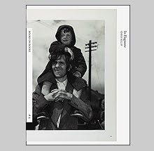
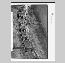
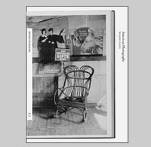
Leo Rubinfien was in New York on 9/11, settling into a new apartment whose triangular terrace points directly where the towers stood, two short blocks away. His new book Wounded Cities published by Steidl explores, not the physical, but the psychic wounds that remain long after moments of trauma.

Rubinfien's is a global story. For over five years, he travelled to cities around the world that had recently suffered from various terrorist attacks. Although centered around 9/11, because that event was his immediate experience, he identifies that the personal psychological aftereffects are just as devastating for the participants in any attack, large or small, whether in London, Moscow, Istanbul, Nairobi or Buenos Aires.

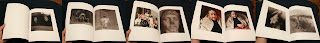
Working in the traditions of the street and mostly capturing his subjects unaware, he created fleeting portraits of passersby that allude to the shock and inner psyche of his subjects. These photos describe the moments when we are deepest within ourselves trying to make sense of the world in our new role as emotional 'witnesses' to these events even if not experienced firsthand. Thought and the search for rationale become last order of self-protection we can achieve.

Much of the artistry of Wounded Cities comes through the text. Rubinfien is a writer whose grace and clarity is found on every page. This is a memoir that acts as his form of therapy, a way to reflect upon all of the new questions raised by the attacks and bounce them off of his rich personal history and experience. Shaped to jump from the present to the past, across continents, into politics and back to family, he creates a complex page turner (a quality rarely found in a photobook text) that reflects his intelligence and vast understanding of different cultures. Rubinfien is truly someone who is at home in the world and his story is a refreshing antidote to the daily dose of xenophobia the news tends to bring in this new era. Wounded Cities is a tribute to humankind that deservedly avoids easy conclusions by not contracting the dialogue of recent terror but expanding it.

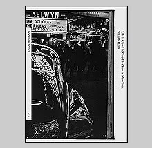
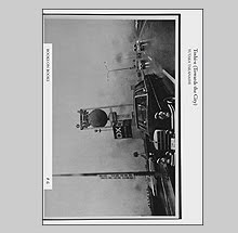
The design and construction of Wounded Cities also makes it an interesting contribution to book craft. Employing many foldouts for the images, its construction avoids a quick scan. It is a book that draws your attention to the text while the photographic foldouts slow the pace, giving the images a chance to sink in. Due to that pacing, small details in the images start to take on additional meaning. The faces we immediately focus upon eventually give way to other discoveries; the stiffness of a shirt, a necklace charm, the printed pattern of a piece of fabric, or perhaps the most remarkable in all of its simplicity, a lapel button hole.

Many books have been published which address the tragedies of terrorism, most having to do with 9/11 and they often touch upon the subject in very similar ways. By using his own experience of that day as a starting point, Rubinfien takes us on a more complex journey within which we revisit our own experiences - experiences that are to this day perhaps still filled with more questions than answers.

Saturday, December 27, 2008

Marriage and Masks by John Stezaker


A recent discovery of mine and perhaps one of the best kept secrets of collage from the past 25 years is the artist John Stezaker. Two books from Ridinghouse/Karsten Schubert feature his intriguing constructions, Marriage (2007) and Masks (2008).

In Marriage, Stezaker uses an archive of movie star publicity portraits he acquired to slice up and find new assemblages of the human face. At once playful and grotesque he matches halves of each portrait, combining them into one image, and transforms former representations of fame and perfection into the macabre. These 'marriages' disrupt the symmetry of the face and draw attention to the contrasts that seem to lie on and under the surface of expression.

It is additionally appropriate that he has chosen to perform such experiments with Hollywood filmstar publicity photos which present a fictional mask to the public while concealing reality beneath. Stezaker's combinations reveal their artifice through the obvious ridge from the razorblade or scissor that dissects each image. In laying one over another they become a perverse illusion where the mind desires a more perfect union but the form keeps the process he has chosen apparent.

The two images may come together perfectly at the edge of a mouth or nostril while other parts of the face slide away from one another. Gender gets confused and man becomes woman or vice versa introducing a second transgressive 'secret' life underneath. Mood and emotion fair no better when combined producing wall-eyed creatures seemingly ready for the asylum.

19 of Stezaker's film portrait collages are presented in Marriage and each appears as an object complete with drop shadow, bent corners and the natural wear of the originals. The book may be thin and the edit small but more would have been overkill. Cecelia Jardemar contributes a smart introduction to the work entitled Unspeakable Faces.


In Stezaker's Masks he continues his exploration of combining images and portraits but now utilizes vintage postcards as the second layer.

Using formal intersections between each image as a guide, he positions the postcard over the faces of the publicity stills to form a literal mask. These contrasting elements are playful, surreal and often grotesque (many of the postcards depict grottos after all) and by blocking any signifier of emotion from the face in the publicity still seem to draw attention to the workings of the mind. The postcards depict representations of space and draw the viewer's gaze inward - beyond the picture plane and into the subject's head - as opposed to creating just another surface.

This deceptively simple act of placing one image over another appeals to me in more complex ways that the cutting and joining found in Marriage. The mind swims with the possibilities of reason behind these works that make their repeated viewings as compelling as the first.

The last four plates in Masks make attempts at placing one postcard over multiple individual publicity stills not of individuals but couples. All titled Nest (there are apparently 6 or more versions) they feature a hand-colored postcard of an owl sitting on a tree branch that has been placed between an embracing man and woman. Either because of the repetition of postcard or the vague implication of the pairings, these feel more forced than the others and leave me scratching my head trying to figure out if these are a natural extension of the first or a wrong turn.

Masks is a companion to Marriage as each book uses the same design, trim size and length. Clean and handsome, these two are hopefully the first in a continuing series of books that will explore each of Stezaker's projects. Masks includes another thought provoking essay, this time by Caoimhin Mac Giolla Leith.

Tuesday, December 23, 2008

Lee Friedlander: New Mexico


To say that Lee Friedlander is a pedestrian would be an understatement. His photographs in Sticks and Stones: Architectural America are almost entirely made from a vantage point confined to sidewalks. He does not venture far from the walking paths that line city and suburban streets - especially since many are made through the windows of his car. His new book from Radius Books, Lee Friedlander: New Mexico, continues his examination of America's social landscape, and again, the sidewalk acts as his compass.

Photographers of earlier generations always spoke of venturing out into the world with camera in order to learn something about our world and ultimately ourselves. Friedlander has set such a defining example over the past 50 plus years by wading deep into the landscape whether it was a city street or a desert full of thorns. Even when he filled the frame with walls of thickets, through which one might make out a mirage of suburban homes, we may have felt there were no barriers that couldn't be crossed. Photography has a unique way of providing a firm sense of freedom and Lee has covered the photographic bases with much liberty.

Oddly, what defines much of his later work for me beyond repetition is a feeling of restriction. Speaking more of the work done along city streets and sidewalks than when he ventures into the wilds of nature, he seems to be venturing out into the world but he is following the same route. Where his work used to feel full of surprise, now it has just become too familiar. For me this is very evident in this new book on New Mexico and this may be where Lee's prolificness becomes problematic. For two decades now he has explored the super-wide square and seems to have settled into a world where the ground pitches upward and buildings stretch like taffy with every new splayed perspective. The geometry is complex and often claustrophobic. The chaos is ordered and damn if he doesn't pack a lot of information into each frame. So why do I feel so restricted with so much to examine?

In almost every photograph in both Sticks and Stones and Lee Friedlander: New Mexico we are looking over a barrier into something. Backyards, public roadways, small swaths of grass, the beds of trucks all act to keep us at bay. Looking at these photos I feel like the detached wanderer that exists on the margins of society and my only real interest is in observing the shiny light that reflects off its surface.

So here I sit writing these words and squirming because I am looking with a critical eye at America's greatest (and certainly most prolific) living photographer. I certainly don't fault him nor the publisher for releasing it, but I do hold it to a higher standard because the words of another photographer - a noted bookmaker - resound in my head - 'Is this necessary?' One of the most damning questions to ask of a book is, 'Is this necessary?' When I look over Lee's accomplishments in 33 books and counting I find it difficult to say yes to this one. It is not because this book is without merit, I think so simply because these bases have been well covered in a few other books now. Almost every photograph here is accounted for in similar versions elsewhere.

What is necessary however is for more books to have the care and attention to the finer aspects of bookmaking which this slim volume achieves. The designers Skolkin + Chickey (Half the Radius team with Darius Himes and Joanna Hurley being the other) have created a beautiful home for this work that extends from the choice of materials to the binding style. Their clean design reflects the open air and brightness of the landscape that is found in the American southwest. The dustjacket features an elegant tip-on reproduction and a quick peek under the jacket reveals debossed type on the raw book boards that make up the cover material. The reproductions are superb with Thomas Palmer preparing the separated files.

Lee is a bookmaker so no doubt I will acquire more titles as he releases them. My wish is that I could get more out of them and be compelled to wear their covers thin with use. Instead, a few of the latest have sat on my shelves like old but cherished trophies whose only chance of getting damaged is when I subject them to an annual dusting.

Sunday, December 21, 2008

Manhattan Out by Raymond Depardon


In the winter of 1980 while visiting New York City, Raymond Depardon spent many afternoons wandering the streets equipped with his camera and black and white film. He returned the following year in better weather and 97 images from these couple trips have been collected in Manhattan Out just published by Steidl.

Using his Leica like a shotgun fired from chest level, the wide angle of his lens gathered information wholesale as he navigated the crowds attempting to work without notice. Usually zeroing in on one or two subjects within his direct path, the photos also collected information on the periphery that often prove more interesting and unexpected.

One thinks of New York as a vertical city, one that seems two-tiered with a street level reality and the penthouse reality. The latter is often imagined but rarely experienced firsthand as that divide is often only crossed with affluence. Depardon's images in Manhattan Out stress the horizontal of the streets and sidewalks and are captivating with their splayed perspectives. The wide-angle lens stretches the foundations of buildings (and sometimes human faces) converting all into an odd
elastic cement pulled at the edges.

Add to this the cutting swaths of sunlight broken by deep shadows (made more extreme by some underexposure) and a seductive stage is set for the various gazes of the pedestrians. Although shooting from the hip, half the characters are wise to Depardon's attempts at surreptitious surveillance. They look, not at Depardon the person who has maneuvered his way into their path but at Depardon the camera whose tiny lens is taking in their likeness. It is this gaze that we settle upon and 'read' for deeper meaning. In the best of which, we are privy to a moment of inner reflection. In the lesser, we are left with people in awkward moments of realization like a deer caught in the headlights.

Depardon's pedestrians are often straight from Central Casting's stable of 'street photographer's subjects' with their fur-lined coats and aged faces. There are more drooping jowls in these pictures than taut cheeks and all is amplified by the folds of fabric that catch the light with wonderful twists and turns.

Depardon in sequencing this book often draws relationships across the gutter. In one image, the back of a man walking with his arms at his sides matches the same shape as his female counterpart on the next page. In another, a man wearing a winter balaclava becomes an ominous shadow (Depardon's) that is cast at the bottom of a photo of an unsuspecting woman in fur coat and high heels. In Central Park two women entwine arms while rollerskating while on the facing page a man is arrested by two policemen. Cinematic in effect, the pace (no pun intended) of our walk is quick and energetic. Depardon has us weaving through the crowds and barely gives us time to settle on the smaller details before thrusting the next photo into view.


Printed on a matte paper with the images surrounded by thick black borders, the tone of the book is celebratory but with a dark side. Certainly not the New York Deniro's Travis Bickle wished a rain upon to wash away the scum and slime but not the Disney wonderland it eventually became either. The size of the book and the grey flexible cloth covered boards feel perfect. The whimsical typography of the title pages seem straight from a Jacques Tati film and set the mood for light-hearted with occasional dips into the difficulty of city life. The cultural and urban theorist Paul Virilio contributes an introductory text.

Books of street work, especially made in New York, can be so depressingly predictable with endless variation on photos we already know so well. What Depardon accomplished with his cinematic viewpoint shot without verticals (there are no verticals in films after all) is a wonderful drift into the flow of life that feels fresh even though we know we've been down this street before.

Friday, December 19, 2008

Deutsche Bilder eine Spurensuche 1992-2008 by Eva Leitolf


A patch of ground where a major moment in history takes place will usually have some type of marker. At places like Dealey Plaza, Ground Zero or Antietam the historical significance is so well known and so strong that just treading on the ground makes an impression. The ground becomes anthropomorphized into a character, a bit player that "witnessed" history - seeming wise and full of experience. But what of all of the less significant sites where the event doesn't even manage to register as a historical footnote - the spot where a person drops dead or is robbed by thugs? Those events, surely significant to individuals and families take on relevance as well on a more personal than public level.

The artist Eva Leitolf, in her new book Deutsche Bilder eine Spurensuche 1992-2008, explores this theme by photographing sites where acts of racial intolerance in Germany were perpetrated.

Leitolf's book is a straight forward concoction of words and primarily landscape photographs. Like Joel Sternfeld's On This Site, the places are described photographically with an ironic beauty and seem almost idyllic in most. She is not describing slums or cities where crime is more common but areas of affluence where the violence is often aimed at protecting the perceived safety or 'purity' of a neighborhood. This, street vigilantism, seems to invoke feelings of striving to maintain a status quo. Leitolf's book runs closely parallel to Sternfeld's as both are equal measure photographs and text. Leitolf's narratives however, also explore how the local population sometimes silently condone the acts.

Deutsche Bilder eine Spurensuche 1992-2008 contains two different sets of photographs. Some are of landscapes that have no outward appearance of the violence and the other set show signs of the actual violence (specifically a series that were made from 1992 to 1994 relating to violence that occurred in the towns of Rostock, Thale, Solingen and Bielefeld) . This latter type reveal the effects from arson on houses and even a few candid images of racist skinheads. I am a bit torn as to whether I like the inclusion of these latter type. When I look at the landscapes alone, there is a powerful disconnect between the violence and the peaceful sense of place. When I am able to see the racist skinheads (which we naturally assume are the culprits or at least condone the violence) I have an obvious target to aim my judgment when it seems like one subtext of the book speaks of feelings that many people are susceptible to. In seeing the skinheads we are able to point to the 'other' and that takes some of the tension away from what these texts and photos raise in ourselves.


Through the texts we discover that many of these acts of violence go unpunished. Either suspects are not caught or when they are, they are let off with what seem to be light sentences with many being suspended by the courts.

Leitolf's photography tends to choose a vantage point which is neutral -- standing back and letting the frame fill with a full field of view. Always shot as verticals, there seem to be distinct parameters consciously decided upon b
y the photographer.

As a book, Deutsche Bilder eine Spurensuche 1992-2008 achieves a cleanliness with its design and format (vertical of course) that add to the sense of historical "purity" in the landscapes portrayed. The handling of the typography which appears on the left-hand page is elegant, both German and English translations are provided. Deutsche Bilder eine Spurensuche 1992-2008 was published by Snoeck.

Wednesday, December 17, 2008

Revisions and Queries by Charles Gute


It is drawing to the end of the year and here sits a large stack of books from Paris and others that arrived over the threshold that need to be dealt with. One that has jumped to the head of the queue is a book that arrived just a couple days ago. It is getting preferential treatment simply because I have been smitten by it. It is one that I would rank very high on my list of PhotoBooks of the Year for 2008 except that -- it isn't a photography book. Charles Gute's Revisions and Queries from The Ice Plant should not be overlooked.

Charles Gute has made his living as a free-lance editor and proof-reader for art books. This entails correcting PDF documents using computer software and making standard copy editing notations to indicate suggested corrections and changes. He remarks that the marked up pages, with their often complicated diagrams, resembled something along the lines of conceptual art. Then in 2004, after his computer hard drives crashed wiping out hundreds of files and corrupting thousands of others, he discovered several where the original texts had vanished and all that was left were his copyediting notations of the mistakes, or what he described as a, "constellation of revisions, comments and queries."

Revisions and Queries presents 51 of these documents as they appeared as single pages after the crash. Stray words and the array of symbols that make up copyediting shorthand become design savvy and often amusing compositions that at times seem to resonate with the artist's work featured in the original (now invisible) text. The most pleasant aspect for me is that this is really art created by chance. By taking ownership of the mistakes of others and his own notated corrections, Gute has combined material that served as a portrait of an artist with his own self portrait, all woven together into a fascinating series of unpredictable tapestries.

Gute is as good an editor of these works on paper as he apparently is as a copyeditor. At no point does Revisions and Queries grow stale nor does it feel at all repetitive. Each drawing stands on its own as an individual pleasure and by the last page I eagerly turned back to the first for another run.

The Ice Plant has published a variety of artbooks over the past few years including Mike Slack's Scorpio and OK OK OK and Jason Fulford's Raising Frogs for $$$. Revisions and Queries is in keeping with their clean and hip design. I had not previously believed in perfection, but after Charles' book I may have to rethink that.

PS: Charles, if you happen to read this, please copyedit the above paragraphs and send me the results. I am certain that my amateurish scribblings could provide you with another book's worth of material.

Monday, December 15, 2008

Solitude of Ravens by Masahisa Fukase


The Rathole publisher and gallery in Japan recently released a new edition of Masahisa Fukase's Solitude of Ravens. This I believe is a reprint of his 1986 book Ravens as well as the American released Solitude of Ravens published by Bedford Arts in 1991. Having not seen the first edition, I can only speculate that they all have the same edit and sequence.

As I spend more time with this book it is quickly becoming one of the coldest, darkest and dreariest visions I've encountered in a photography book. For Fukase, ravens, as they are perceived around the world, are bad omens and it is quickly established through his sequencing that we are not in for a journey that will end well. Within 7 plates, the sky is black with them and when we encounter the first humans they are nothing but shadowy forms within a landscape so inhospitable I can only think that we are descending into the outer rings of Dante's hell.

Blurry, grainy, black and white 35mm photograph do Fukase's bidding to keep us detached from reality and steeped in dark metaphor. In one image a silhouette of a boat appears through misty waters with two black figures guiding, but when we encounter the skiff a few plates later, it has been submerged and all that remains are ravens perched on its wooden edges.

The creepier aspect of the book is that the ravens aren't the villains, just the messengers. There are darker forces at work that even claim the lives of the birds. One gets eaten by a scowling cat while another is killed and tied to a pole perhaps as a talisman, but the darkening skies refer to something that can't be reasoned with.

In two curious images, a fleshy nude woman laying on a bed is followed by an image of what looks to be a fish that has been landed and killed. Both the woman and the fish have similar soft fleshy qualities that we may come away with the sense that the former has transformed into the later - a premonition of the future.


Fukase continues our journey and the landscape becomes bleaker and darker, now we drift into industrial towns whose skies are now darkened by factory towers belching black pollution. The flocks of ravens become more frantic until a dozen or so photos late in the second act shift the mood to an eerie calm. Just as life seems to brighten and perhaps calamity avoided, a jet screams overhead and within moments we are engulfed in explosion and a firestorm that leaves the landscape an apocalyptic wasteland. One sole survivor is left sitting dumbfounded in the debris.

The idea that this book refers to one of the darkest moments in human history with the dropping of the bombs on Hiroshima and Nagasaki or of the industrial nightmare that has consumed much of modern life do not tie this work into easy conclusions. Fukase's power comes from the feeling of isolation as we drift alone through his world, observing it from a distance. We are not a part of community but a stranger that appears at its margins, never penetrating or connecting with exception of a single rendezvous with the fleshy woman. All the while we are left defenseless, like the homeless man in the very last photograph shuffling off with his back to the camera.

This version of Solitude of Ravens is hardcover with an attractive slipcase and is published in 1000 copies. The cover cloth is debossed with Fukase's signature and an image of a raven. The printing is beautiful and rich. Like most all of Rathole's books, the design is elegant with a hip sensibility that makes these objects hard to resist.


Available through Rathole Gallery

Thursday, December 11, 2008

Other Nature by Ron Jude


It is interesting to follow the traditions of photographing nature. Back in the day, photographers ventured into that genre to show Mother Nature's grandeur and celebrate its poetry. A 'natural' subject perfectly suited to this new invention that required a certain amount of stillness and one that could be found in abundance.

Landscapists like Timothy O'Sullivan were early to interject a different tenor to their images through inclusion of lesser idyllic subjects such as the effect of man and war on that landscape. This shift in attitude was most profoundly felt almost a hundred years later when the American photographers lumped into the "topographic school" started their more critical and perhaps more cynical approach. The pictures became more about us and how we would venture into nature to slap the old bitch around. In turn, anyone continuing with the older, more pure celebration, even the best like Eliot Porter, started to look like kitsch.

Contemporary landscapists seem to avoid the traditional "obvious beauty" and concentrate on the ironic in Mother Nature's lesser successful experiments. Often found in the area that blends man's territory into the wild, these trampled but not quite dominated areas become fodder for comment on our current love/hate relationship with the land. Light rains down on the brambles and felled trees with a beauty that is passed onto discarded garbage and we are momentarily struck with the tension of the irony.

Ron Jude's book Other Nature just published by The Ice Plant explores this 'occassional-man's-land' in complex and subtle ways.

With a large format camera and color film, Jude responds to these places with an eye for both the beauty in the wear and tear but the real subtext seems to be one of accessibility. At every turn, Jude makes it difficult for us to venture far without man-made or naturally occurring roadblocks barring our access. A running steam, fallen logs, an impenetrable bush and even a threatening looking garden-hose/snake imply that, if we are really committed to experiencing "the other," there are going to be certain risks involved. An opening in a stand of trees and bushes may look inviting at first but the darkness that would quickly envelop us is certainly disconcerting.

Interspersed among these images are others of man-made representations of nature. Fake wood-grained furniture and flowery patterns in fabrics may remind us of the beauty and virtues of Mother Nature without that risk - the American replacement of nature is easy on the conscience and a lot more convenient. Even light can be provided at will or filtered to our liking.


Jude's photographs are very well made even though many are similar in form. My harshest criticism of this work is that the repetition makes itself felt after several viewings. The exteriors share a common distance and scale as do the interiors from their close-up vantage point. In those close-ups Jude has us seemingly trapped in a hotel room where we examine the details with crazed intensity. The result has a comic tone for me that is part of the joy of Other Nature. We are either keeping ourselves locked in or nature locked out. What seeps in by way of faux wood-grained items is a mere extension of the exterior spaces but mannered and superficial.

As a book Other Nature is very well conceived. The sequencing and edit follow an interesting path without being jarring or obvious. The printing is good and, as with all of The Ice Plant's titles, the design is clean, cool and thought out down to smallest details.

Tuesday, December 9, 2008

Avenue Patrice Lumumba by Guy Tillim


The clash of ideas and cultures can be found in many areas of the modern landscape but few are so jarring as can be found in the architecture of former colonial states in Africa. Traces of French and Portuguese sensibilities and colonial idealism are still found on display in the civil buildings that have now shifted their use with contemporary African culture after independence in the early 1960's. The South African photographer Guy Tillim's new book from Prestel, Avenue Patrice Lumumba explores how these modernist structures have become an integral part of the culture and absorbed into its identity.

Patrice Lumumba was an outspoken leader who challenged the Belgian status quo which favored, not rule of the land but recognized only the rule of the powerful. After winning the 1962 Congolese election and assassinated by Belgian agents that same year, he became deified as a liberator of independent Africa. Today in many African cities, streets and squares bear his name in honor.

As Tillim describes this work, "These photographs are not collapsed histories of post-colonial African states or a meditation on aspects of late-modernist colonial structures, but a walk though avenues of dreams. Patrice Lumumba's dream, his nationalism, is discernible in the structures, if one reads certain clues, as is the death of his dream, in these de facto monuments. How strange that modernism, which eschewed monument and past for nature and future, should carry such memory so well."

Tillim offers those "clues" with sparsely populated interiors and exteriors that reflect more abandonment than use. When we do get a look into an office where people are working, the new use seems improvised and rarely inviting. The infrastructure has become an odd hybrid of decay and idealism that Tillim's camera searches out with an eye for beauty.

His palette of muted colors and grays leaves everything feeling like it is coated with a light layer of dusty residue. When he does describe scenes with people he often renders them as slivers of human form that are now integrated into the structures. A man sits on a window sill leaning in a way that we can only see his waist and leg. Another stands at a window with his back to us, looking out at the landscape - seeing his own culture through colonial glass. Even when he photographs workers in what feel like more direct portraits they come across as not portraits of person but place.

Tillim's stance is consistent, rarely does he emphasize a subject by distance but rather allows the small details to be discovered within the larger spectrum. The looping straps of a woman's purse somehow draw our attention among a clutter of bookcases and furniture. A man sits at his desk but it is the small plant sitting in a container marked chloride whose vines extend upwards due to a rigging of string to a dilapidated bookcase that we fixate on.


Outside, the courtyards and gardens hold the decayed corpses of monuments both celebrating independence and others holding tight to colonial ideology. These sit as almost defunct reminders while the buildings replace their significance.

Avenue Patrice Lumumba is a larger format book than Tillim is usually known, his Congo Democratic being the exception. Avenue is beautifully printed and although the images pass through the gutter in every spread, I am happy that the designers took advantage of the size to do so. Each plate becomes a 16 x 20 print and allows us to be consumed into the landscapes and interiors. That said, there are a couple of heavily center-weighted images that suffer under this choice.

The edit and sequencing is well-done if classic in its 'leading into' and 'out of' the subject. It includes a brief introduction by Robert Gardner and a statement by Guy Tillim. The work in Avenue Patrice Lumumba was funded in part by the Robert Gardner Fellowship in Photography granted by the Peabody Museum of Archaeology and Ethnology at Harvard.

Sunday, December 7, 2008

PA: Jeff Wall & Patrick Faigenbaum


One aspect of Paris Photo that was most enjoyable was meeting the people I have been collaborating with on my own books. Most of the coordination and production had been accomplished through email and file sharing software so to put faces to the contributors was indeed a pleasure. Upon meeting David Campany who contributed the essay to our Atget - Photographe de Paris book, he gave me a copy of a new magazine project called PA that he has just started with Christine Bechtler and Amy Cappellazzo.

PA will be published twice yearly and is a very high quality softcover magazine/book where each issue "aims to present an in-depth look at the oeuvre of a contemporary artist working in the medium of photography." Their approach is unlike any magazine I have seen thus far in that they invite an artist, who in turn, invites a second to be featured in the same issue. Each artist is then asked to edit and sequence their own work into portfolios and towards the end of each issue is a transcript of a dialogue between the two.

It is a magazine that offers new insight into their work through a collaboration instead of a simple presentation. The first issue is with the Canadian artist Jeff Wall, and Wall invited Patrick Faigenbaum to participate.

Wall is an interesting choice since he has a resistance to sequencing his works due to the possibility of submitting the work to connections and "relationships" which he has avoided in the past. "I feel the presence of that thematic architecture takes away something from the pictures, reduces their sovereign relation to their subject matter." Faigenbaum has had a similar approach as well with his own work which makes it an interesting compliment to Wall.


The artists present about 30 images each in both black and white and color reproductions and the supporting content contains high quality, thought provoking writing by David Campany, Mark Bolland, Georg Kohler.

PA has a high standard of production with good printing and a large 9.5 x 12 vertical format. The paper stock is as fine as most artbooks and the entire package has a surprising heft. PA is published by Inktree out of Switzerland and retails for around $30.00 USD.

The distribution of this title is being worked out at the moment. I have been advised to tell people to contact David Campany for ordering information.

Thursday, December 4, 2008

101 Billionaires by Rob Hornstra


Two dogs meet on the street in Moscow. The first dog says, "How are things different for you with Perestroika?" And the second dog says, "Well, the chain is still too short, and the food dish is still too far away...but now we are allowed to bark as much as we want." - Anonymous 1995.

There is a telling moment mid-way into Rob Hornstra's 101 Billionaires. While visiting some young addicts, one of which suffers from Aids and drug-resistant TB, a woman describes Hornstra and his friend as "a pair of snotty disaster tourists." Such is the burden of young documentarians as they try to describe various aspects of contemporary Russian life.

According to statistics, Russian now has 101 Billionaires - people who made their fortunes as the wall fell and the empire collapsed buying cheaply the newly privatized industries. These few rise into a strata that shields them from the difficult reality of everyday life. Outside of Moscow, many smaller towns suffer from a lack of jobs and for the young, seemingly endless months of boredom. In turn, drugs, drinking and prostitution become common alternatives to pass time or earn money. Many of the images sadly imbue feelings of a female sexual awareness formed out of desperation. Young women compete as strippers (the winner receives a trip out of the country) and even when the photographer asks one to just "stand normally," she insists on staying in character, striking a softcore pose.

Hornstra weaves a fascinating trip through the lives of individuals, especially the young, who are forced to grow up too quickly and it may seem inevitable that all will end badly. Through photographs and compelling writing, 101 Billionaires is less disaster tourism than a book that cuts a wide swath through the contemporary hard Russian realities. It emphasizes the gap between the older generations who knew the old empire and feel a strong connection with it and the young 20 somethings who seem to be desperate to escape its void at all costs.

Hornstra's photography seduces with its use of bright evenly lit strobe and cleanliness of description. Its language and mix of staged portraits and still-lifes paints with an uneasy but loving curiosity. Hornstra is not 'snotty' but he surely knows how complicated photographs can be. He doesn't condescend or reduce individuals to stereotypes, his curiosity places him in the ranks of the documentary-style photographers whose tradition he follows.

An interesting comparison would be to Luc Delahaye's Winterreisse except where Luc's portrayal is a claustrophobic thrust into the hellish underbelly of post-Soviet life, Hornstra's allows the mood to be livened by showing the hard realities with a twinge of humor and at least some air. Both of these artists have a way of pushing their subjects into their own photographic realities and I suspect something resembling an actual portrait lies somewhere in-between.

Much of the contribution to this book is by way of the texts. Extremely interesting and well written by his two collaborators, Hans and Aldus Loos, these splendid short essays fill in the details that the photographs cannot. Unlike many text heavy books, this is a perfect balance of text and image. All of the authors know how to keep to the point without diluting the overall journey.

101 Billionaires has a great design with foldout text pages that allow the photos to exist on their own first. Inventive and clean, this is one of my recent favorites brought back from Paris. Only published in 1000 copies and going fast, this is sure to be recognized as one of the best books of 2008. It has already made my list and I doubt 9 newer books will be published by the end of the year to knock it from its rightful place. 101 Billionaires by Rob Hornstra was self published by his imprint Borotov.

Available from Borotov

For people in New York, Dashwood Books will have signed copies within a week.

Tuesday, December 2, 2008

Errata Editions Payment Notice for Limited Edition Sets


Finally...Finally...the wait is over. The first of the Errata Editions Books on Books series has arrived to the United States! Our ship didn't sink. The container didn't fall overboard. They didn't fall off the back of the truck and wind up being sold on the streets of Secaucus for pennies. They survived the long journey from China in perfect mint condition with no bumped corners or anything.

So...if you have reserved a set of the limited editions, you may now pay using the Paypal button on the Errata Editions website HERE. Make sure you specify your country of delivery so it can calculate the shipping. If you would like to send a check or money order instead please follow the instructions on that same page. For the first five people that ordered that received the free shipping (you know who you are) just email me and I'll let you know how to proceed.

For those that have paid, we are packing them up and getting them out now.

There are sets of the limited editions available so if you're late to the party, check them out. They aren't much more than the regular trade edition that will be distributed by DAP...but you get them now and they feature the elegant tip-on bookcover image. The regular editions will be distributed in February.

Thank you again for the show of support from everyone. The proceeds from these limited edition sets will fund the next four books, so those that are able to purchase a set are contributing to the life's blood of this project. Thank you and enjoy!