Saturday, January 31, 2009

Bureau of the Centre for the Study of Surrealism and its Legacy by Mark Dion


“Collecting is creepy...Everybody is convinced that his way of collecting is superior. They look down on casual collectors, who are just accumulators -- the kind who’ll just pick up anything and let it pile up. A true collector is more of a connoisseur, and that’s the good thing about collecting. It creates a connoisseurship to sort out what’s worthwhile in the culture and what isn’t. Wealthy art collectors in this country have sorted out who the great artists are. If you’re collecting a lot of objects of one particular kind, you develop a very acute sense of discrimination.” - Robert Crumb

Walter Benjamin observed that the surrealists were the first to seek potential in the "by-products and refuse of modernity." In keeping with this line of inquiry, the artist Mark Dion created a fictional Bureau of the Centre for the Study of Surrealism and its Legacy and it is also the title of his artist book published in 2005 by Bookworks.

As the essayist David Lomas writes in his introduction, Dion's "bureau" is not filled with "lobster telephones or other cheap surrealist cliches," but rather, "old-fashioned instruments that speak most poignantly of extinction." Teaching tools and artifacts that reflect outdated educational approaches or curatorial styles are saved from the incinerators to provide interesting connections between objects that freshly delight and surprise.

Dion's assemblage reflects on the past with its manner of classifying and finding the relationships necessary for such classification but disrupts this process with his more tangential editing process. it reveals a new universe which is documented by real facts and at the same time, presented with a subverted and surrealist view. By creating this new order, Dion has reshuffled the deck, but all the while the work insists on its authenticity. When Dion created an installation of the "bureau" in the Manchester Museum it was camouflaged to look like just another office.


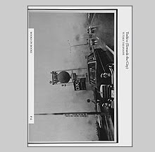
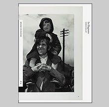
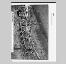
The objects, many of which are scientific images from biology and botany, range from the commonplace to the freakish and in a typical surrealist mode, the most commonplace come across as the most bizarre. A delightful collection of display caption cards attests to this in poetic fashion: Medicine Man's Wand; Diminutive Axes - Honduras; Dog Rattles: Tied round the thighs of dogs used for driving antelope; Stone object found in a grave - exact locality unknown; Message Stick - Sent to Mr. Webb, an Albany naturalist - The notches are said to signify, "Webb, send tobacco and money to black-man!"; Domestic Bygones - Lent by F. Ollerenshaw Esq. Wilmslow.

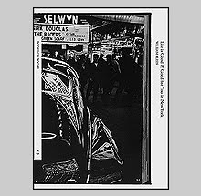
As a book, Dion's bureau stands as mimetic to a real museum of research as his installation looks to have done. Presented with a poker face of genuine inquiry rather than a Joan Fontcuberta-esque wink, it is organized into eight sections; The Museum, Dept. of Zoology, Dept. of Botany, Dept. of Earth Science, Dept. of Ethnology, Dept. of Archeology, Dept. of Paradoxes and Numismatics, and Archives. The numbering of the artifacts (cat.001 through cat.106) implies a continuum, inviting comparison and study to discover the tenuous links and categorical flow. Logic and illogic become engaged in an endless tug of war. The printing and design are exquisite.

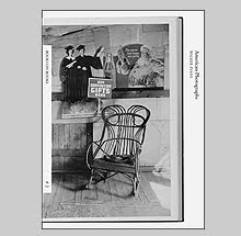
In keeping, consciously or not, with the surrealist preoccupation with the image of "doors," Dion's book cover depicts a wooden door with its title etched into the frosted glass. But unlike Duchamp's Etant donnes... where we are limited to peeking through a hole in a barndoor, Dion provides us with the keys to enter, but ultimately the ways of unlocking the inner displays prove to be as infinite as our own imaginations.

Wednesday, January 28, 2009

Intersections Intersected by David Goldblatt


Before transferring power, the Nationalist Party wants to emasculate it. It is trying to negotiate a kind of swap where it will give up the right to run the country its way in exchange for the right to stop blacks from running it their own way. -Allister Sparks, South African journalist

The economic shackling by the World Bank, the IMF and the GATT agreement of Mandela's African National Congress whose 'freedom charter' promised to reduce the vast economic gap between whites and blacks in South Africa, has been the cause of doing the inverse - widening the disparity between races. Economically, South Africa has surpassed Brazil as the most unequal society in the world. The older visible face of Apartheid has not withered and died but simply been given a cruel facelift.

For the photographer David Goldblatt, who has effectively documented the entire Apartheid era through its supposed 'change' to democracy, his new book Intersections Intersected could be seen as a pictorial image of that facelift.

Intersections Intersected represents carefully paired images, one from his various older b+w work paired with a 'post-Apartheid' color photograph. In doing so Goldblatt invites comparison that spans time and recognition of change but this book is not so tidy in its framework. The connection is not always apparent as most actually resist such a linear comparison. Instead they explore sometimes similar, sometimes contradictory meanings but always temporal in nature.

The Intersections project was originally conceived to be a series of images made at the literal intersections of latitudes and longitudes throughout South Africa. This neatly packaged concept proved unfruitful as many of those intersections left Goldblatt uninterested and at a loss as to what to photograph what he found in situ. This concept instead turned towards cross-points of history, society and politics which, as Ulrich Loock writes in his essay History in Motion, were exactly the kinds of intersections Apartheid sought to prevent.


The temporal metaphor is also explored through the physical descriptions Goldblatt created. His shift from b+w to color at the most basic level can be seen to represent the change from a physical world that wants to make clear distinction based on black and white to one where a rainbow of color must now be considered with more complexity.

What we may read as the 'evidence' that Goldblatt offers from photograph to photograph blur the clear markers of division for newer markers of which only their effects are revealed. They are examinations of ground that holds so much history that it taints all that sit upon it, and the masks that attempt to conceal mostly prove to amplify. The physical signs for Whites Only are no longer necessary, the real discrimination has transcended the physical world into one dictated internationally by ones and zeros and unseen forces.

David Goldblatt's work in book form has mostly dealt with subject groupings; a particular town (In Boksburg); natural resources and economic disparity (On the Mines); architecture (The Structure of Things). In Intersections Intersected, it has now come to cross reference itself with a newer understanding of what it has been describing. With time we see things differently. They say hindsight is twenty-twenty, but in a book where we would expect to see 'difference' it looks like a modern face of more of the same.

Intersections Intersected was published on the occasion of an exhibition at the Fundacao Serralves in Portugal. It includes fine essays by Ivor Powell and Ulrich Loock.

Monday, January 26, 2009

Great Stalinist Photographic Books


A recent discovery has left me delirious with graphic design overload. Great Stalinist Photographic Books is a must own for all fascinated by the chapter in Parr/Badger on propaganda books from around the world. This is a Russian version of The Photobook: A History with over 70 little known Soviet era photobooks.

Profusely illustrated, each title is treated to more plates of spreads than is usual from compendiums on photobooks with in some cases as many as a dozen shown for an individual book.

Large in format and 256 pages it is very substantial but before you get too excited...there is almost no English translation. For those who can't read cyrillic this will be pure eye candy until you bribe a Russian friend to translate.

Even though no translation, the individual texts for each book seem to be limited to the basic publishing information so I assume we are not missing out on much. There is a 36 page introduction but how much it allows for discussion of each book isn't known to me either.

The other disappointment is that it was published in 2007 and is already out of print. I purchased mine from Ebay for $100.00 + shipping and it is posted often. You can purchase directly from a man named Anatoly at yellowcaptain(AT)gmail.com. He is trustworthy and packaged my copy with a flare for the Old World. Wrapped in bubblewrap and covered in brown paper and twine, I saved the package because it is a work of art in itself. He managed to safely enclosed the book in its wrapping without using any tape at all.

Friday, January 23, 2009

The Thirty-Two Inch Ruler/ Map of Babylon by John Gossage


"It is too easy to assert that those with whom we disagree are not just wrong but tyrannical, fascist, genocidal. But it is also true that certain ideologies are a danger to the public and need to be identified as such. These are closed fundamentalist doctrines that cannot coexist with other belief systems; their followers deplore diversity and demand an absolute free hand to implement their perfect system. The world as it is must be erased to make way for their purist invention." - Naomi Klein from The Shock Doctrine: The rise of disaster capitalism.

And the one who was seated on the throne said, "See, I am making all things new." Also he said, "Write this, for these words are trustworthy and true." -Revelation 21:5

"Home is where the heart is." -Peter, Paul and Mary

We shape our surroundings to embody the moods and ideas we respect. In the case of certain neighborhoods, surroundings may reflect a collective set of ideas. In gated or vastly affluent communities, those set of ideas are protected and defended against any contaminant that threatens the status quo. John Gossage's newest contribution to the genre of artist book called The Thirty-two Inch Ruler/Map of Babylon is a look into power and privilege implied in the surroundings of his own neighborhood of Kalorama, Washington DC.

Gossage prefaces his images by informing us that Kalorama's most famous (or infamous) resident is the former Secretary of Defense Donald Rumsfeld. Kalorama is an area where the private homes are interspersed among embassies and the residences of ambassadors. It is a community that is patrolled by three overlapping public security forces as well as the occasional private one when important dignitaries come to visit. Gossage describes it as, "A place of beauty and calm that you might choose to live, if you could. A place that makes visual the affectations of wealth and political power."

With such prodding, The Thirty-two Inch Ruler side of the book (I will explain later) draws the ideologue out of you. Most will have a tendency to find this portrait disturbing as it comments on the heritage of privilege and how the powerful can shape the world to their vision of what they think is best to meet everyone's desires (or at least the desires of the few that are important). It is the desire for the clean slate upon which to draw perfection. That may at least be the idea.

What Gossage shows is this ideology of the ruling class intermingled with small fissures that chip the foundations. The easy read is that it is a portrait of a crumbling empire but instead it seems to speak of one that is settling deeper and growing stronger roots - a foothold against contaminants. His color photographs with their identifiable style of very shallow focus and attention to detail overflowing with metaphor toy with our fear of powerlessness and yet appeal to our desires of wealth and power. Although we may despise Rumsfeld and this administration's power grab and bully tactics - and by extension Kalorama is the physical representation of those policies - it is the American Shangri-La which we also secretly covet.

Gossage's vision of this neighborhood is emptied of any human presence other than his own. Yards, fences, sidewalks and doors are all examined and the tone is that we don't belong and certainly a camera in this area would draw much suspicion. Gossage may belong but he is a spy among the hedges trying to see evidence of what this has all cost. What proof can be gleaned from these small details that speaks to the wider 'belief systems' and our aversion to them?

Gossage's 'ruler' (a play on words - read 'de facto dictatorship') is shortened. The 'haves' measure with a different scale which doesn't reflect the reality faced daily by the 'nots.' It is a split quantity that benefits some and short changes others. It is fitting that the 32 inch ruler that spans the first few pages is from a federal bank, and even more fitting that it is one that has since changed its name.


When the book is flipped we find another body of work called Map of Babylon, upon which one page states these are 'Photographs with qualities, but no real explanation.'

If we tend to read the Kalorama photos as a physical manifestation of an ideology then the Map of Babylon p
laces us back into the real world with all of its imperfections. It is a mixture of diversity where heritage blends with the nouveau riche in a world built by the proletariate. The first photograph is of a door peephole, and if one happens to look at the ruler side first, it is natural to deduce that we are looking out through our protective door of affluence into what we keep at bay and fear. Certainly not a horrorshow of crime and chaos but our 'drift of affluence' has pushed our tolerance meter to zero. The contaminants approach.

What form those contaminants take is a landscape of crushing debt to the Chinese, religious conflict, reminders of tragedy and war, dismembered hands and spilt blood, danger, short-term fixes, offensive decay and markers of defenselessness and vulnerability. We become aware of what were previously
innocuous still-lifes and imbue them with signals full of meaning and the propaganda of blind fear promoted by the powers-that-be. The last image of a darkened doorway offers only a slight glimmer of hope with a pin prick of light emanating from the peephole (you guessed what is on the otherside, just flip the book).

The Thirty-Two Inch Ruler/ Map of Babylon is an ongoing cycle. It is two chapters which hold no order or hierarchy over one another and have no correct starting or finishing point. Designed with John's usual eye for playful form, the 'ruler' side features small rectangles of color that correspond to color in the photo on the opposite page.

This book will be officially published by Steidl next year. It was supposed to be released before the election but due to scheduling delays it was pushed back. What I am reviewing above is a small edition published via print-on-demand technology that came with a signed inkjet print and released for a scheduled booksigning at Paris Photo. The spine reads Stiedl Temporary Editions By John and Gerhard. Read that again...Stiedl (pronounced 'shteedel'). The final book is slated to have an introduction by Gerhard Steidl himself and John assures us in this volume that "it will be very good."

Monday, January 19, 2009

News Art: Manipulated Photographs from the Burns Archive


The last time I perused a book authored by Dr. Stanley B. Burns I had to sit with my head between my knees until I could regain my composure. Burns, a New York opthalmic surgeon, has amassed a collection of over 800,000 images pertaining mostly to medical and criminal photography and has published 19 books on subjects that are definitely not for the squeamish. His books have included: Deadly Intent: Crime & Punishment Photographs; Seeing Insanity: Photography & the Depiction of Mental Illness; Oncology: Tumors & Treatment; Respiratory Disease: A Photographic History; A Morning's Work: Medical Photographs from the Burns Archive; Face of Mercy: A Photographic History of Medicine at War; and Sleeping Beauty: Memorial Photography in America.

Dr. Burns and Sara Cleary-Burns have teamed up this time for a less disturbing presentation of images called News Art: Manipulated Photographs from the Burns Archive published by Powerhouse. Where many of the photographs in the Burns archive were produced for the eyes of few, these in News Art were created for public consumption in newspaper and periodicals that appeared between 1890 and 1950.

Due to technological limitations concerning printing clear reproductions, many news images were subjected to manipulation through application of collage-like techniques and vast retouching with brush and ink. News Art presents examples of artistically enhanced images that blend of art and journalistic photography in order to provide a clearer illustration of a story.

These one-of-a-kind images, each handcrafted, describe crime scenes, socialites and celebrities, war and human interest stories. While many employ a simple pen and ink outlining of the main subject in order to make it stand apart from the background, some interestingly attempt to convey passing time through a hybrid of photography with hand drawn illustration. These more complex constructions often draw attention to the limitations of the medium at the time to describing its subject clearly or as a sequence of events.

These older techniques are so apparent, they give the sense of a less nefarious use of manipulation than what today's seamless photoshopped fictions imbue. Seductive in similar ways to the art of the day, many of these look as if they could have fallen from the archives of Dadaists Hannah Hoch, Johannes Bader, Raul Hausmann or even Max Ernst.

Isadora Duncan's daughter Irma is shown sitting cross-legged in a chair while the background has been artificially whited out creating a beautiful, albeit unintended, composition complete with crop marks and measurements in black grease pencil. A frontal portrait of the suspected murderer Alex Miller is shown with the remnants of a sketched question mark surrounding his head with the words 'Is he guilty' printed across his chest. A photomontage of Pancho Villa boarding a train presents a combination of portrait and photo-op with images of his North Division fighting during the Mexican Revolution.

One of the pleasures of these images is seeing the hand at work. Today photography is often so removed from appearing handmade due to the cleanliness of description and the technologies allowing for cleaner outputting of prints. Once was the day when photography was an imperfect science. Dust on prints was 'spotted' by hand with a brush and could be seen if the print was held at an angle to light. Photographic paper run through chemistry and eventually re-dried will refuse to lay completely flat. These slight flaws connect us with the creator in ways that, like the techniques, have faded as well.

Journalistic integrity today has been "improved" with clear disclosure of images subjected to manipulation by labeling them as "photo-illustrations." Clearly these charming examples of the early years in "photo-illustration" on one level appear crude but with deeper consideration are they really much different from a photographer adjusting the levels of a digital file in order to make the photograph lighter or darker? Even subtle adjustments are a form of manipulation and shift perception. In many ways the obvious nature of these make them more truthful than the current applications of manipulation that want to insist on invisibility.

News Art: Manipulated Photographs from the Burns Archive is a handsome volume. The clean design honors the work and the printing is well done. One aspect that I appreciate beyond the content is the materials lend a nice feel to the whole package from the matte paper stock with its slight tooth, to the fully illustrated boards hidden under the dustjacket. This is a book whose subject could have been easily subjected to a generic treatment of book-making but like many of Dr. Burns' past titles, News Art achieves an elegance that celebrates these previously unstudied masterpieces of bold expression whose language is sadly no longer spoken.

Friday, January 16, 2009

The Book of Beth and Picture Imperfect by Kent Klich


Almost twenty years ago the photographer Kent Klich released a book on a woman named Beth R. who was an addict and prostitute living in Sweden. The Book of Beth published by Aperture was an unnerving portrait of trust and intimacy between a photographer and subject or rather, between two friends. Shot over the course of three years in the mid-80s, Klich describes the spiral of hardship this one woman faces without moralistic tone or even triumph over the adversity.

Sharing certain conventionality with other photojournalistic books documenting difficult lives or situations, The Book of Beth shocks the viewer at first due to the shattering of any barrier to intimacy. It is undeniable that on one level it is a voyeuristic look into a life, a life so depressingly described that we breath a sigh of relief that we have not had to live through what she has. It's subject is so extreme that for the viewer it is easier to step away and see Beth as 'the other,' and not come away reflecting on the destructive dependency that nearly everyone holds somewhere in their lives.

This darkside of humanity has a magnetism for photographers and in the worst examples they are triumph over adversity, human interest stories that reduce complex physical and emotional relationships down to the lowest common denominator. Beth's story is in some ways so dangerously cliche, full of the destructive foundations that set the scene for what follows; abused as a young girl by her mother, spent much of her childhood in and out of various foster care facilities, and perhaps the most horrifying event that can link her later life - turned out as a prostitute by her own mother. Luckily, either by Klich's doing or by Beth's strong presence, she is not reduced to stereotype but expanded into a full person we may connect on some level with. The Book of Beth presents all of this material including doctor's reports and personal text by Beth, weaving all into a collaborative autobiography that shows both vantage points of an inner and outer life simultaneously.


Since 1983 when they first met Klich and Beth have remained friends and this year sees the release of another visit to Beth R's story in Picture Imperfect published by Journal.

Again Beth and Klic
h act as collaborators in assembling a disturbing family album that explores the early influence of home on what we become later in life. Using childhood photographs interspersed with Kent's early black and white and more recent color images, they expand her self-portrait to explore that disfunctional parent child bond.

It is through the disconnect of these traditional family album photos and the newer portrait os the addict/prostitute that we reflect upon what lies under the surface of appearance in photographs or appearances in general. In the photos, Beth's mother certainly doesn't look like a woman who would prostitute her own child but then human nature is far more complicated than one's ability to momentarily smile at a camera.

In Picture Imperfect, Beth is now clean and has been living with a man named Kim for the past ten years. It is not the happy ending one wishes for as she seems to do daily battle with depression and constant pain but it is an improvement. Like the transformation that Beth is going through, Klich has gone through one himself. Switching from the language of traditional documentarian, his newer color images are less obvious and more metaphoric. The sequencing of the images lends to a mix of flashback and fast-forward that keeps the connection to history fresh and full of tension.

The book comes with a DVD called Beths Dagbog (Beth's Diary) which was partially shot by Beth and completed in 2006.
It is here that we get a better sense of her feelings towards her mother as part of the 30 minute documentary is centered around the mother's request for Beth to come see her for her 80th birthday. Beth's anger bordering on hatred after agreeing to be present is a raw and self protecting response to the constant open wound that has never healed. The actual meeting is not shown but her tone afterwards of seeing her mother, now blind and alone, is one of pitying her for her mistakes. It is not necessarily a moment of forgiveness but perhaps an important moment necessary for moving on.

My only complaint with the film is the use of sorrow filled music at certain moments when it is simply not necessary. W
e know this is a difficult biography as it is permanently etched into Beth's face and features. The toll of hard living shows in her expression, we do not need artificial prompting of our sensations.

Several books have used the concept of the family album to shape a narrative of a life and although it may seem an obvious choice for this work, it works very well. It achieves a shaping of the content that isn't overwhelmingly difficult to experience while remaining unflinching in its honesty. The first release, The Book of Beth flirted at the edge of such a chasm, that like Jessica Dimmock's The Ninth Floor, you may not want to spend much time with its pages.

The revisiting of Beth's story twenty years later for some skeptics may feel forced. Often photographers have revisited older subjects and they feel less like an update on the subject than a desire for the photographer to revisit the freshness of their earlier work. That isn't the case here as one senses the thirty year relationship between these two people would have been a constant whether a camera was present or not. Besides her decade long life with Kim which seems extremely healthy and supporting, this other with Klich has contained additional love and respect, neither of which unrequited.

Note: If anyone knows the website for Journal can you pass it along.

Wednesday, January 14, 2009

Jan Tschichold Master Typographer: His life, Work & Legacy


I first became aware of Jan Tschichold not through his most well known contribution Die Neue Typographie (The New Typography) but rather his poster designs for Germany's largest cinema the Phoebus-Palast. These posters dating from the late 1920's combine photographs and type into dynamic compositions that reflect the spirit and energy of the avant-garde and could be seen as creating a corporate identity for the theater as all shared common characteristics.

A new book from Thames & Hudson, Jan Tschichold Master Typographer: His life, Work & Legacy, offers up a seemingly exhaustive look into one of the most outstanding and influential designers of the twentieth century.

For many Tschichold's Die Neue Typographie was the necessary handbook in which to break with traditions in typography that didn't correspond to modernism. Asymmetry, positive use of empty space, use of contrast and color were its principles to help develop "its visible form out of the function of the text." Through paradoxical theories of standardization meant to bring about order, design could achieve an efficiency of use not formerly recognized.

One principle of Die Neue Typographie was his insistence on the use of a sans-serif typeface. 'All lettering, especially type, is first and foremost an expression of its own time, just as every man is a symbol of his time. What textura and also rococo type expresses is not religiosity, but the Gothic, not cheerfulness, but the Rococo: and what sanserif expresses is not lack of feeling but the twentieth century!'

It would be twenty some years later that Tschichold changed his position on his ideas about the principles of Die Neue Typographie. By 1946, Tschichold had formulated new criticisms that were notable for their political and moral arguments. The most damning of which appeared in print: 'Its (Die Neue Typographie) intolerant attitude certainly corresponds in particular to the German inclination to the absolute; its military will-to-order and its claim to sole power correspond to those fearful components of German-ness which unleashed Hitler's rule and the Second World War.' On a less hostile note, he also later recognized the dominant legibility of serif typefaces over their sans-serif counterparts.


Jan Tschichold Master Typographer includes five contributing writers that discuss Tschihold's career running from early poster design, to the reworking of Penguin books, to his creation of the typeface Sabon. Lavishly illustrated with over 330 color and b+w plates this volume is a fitting home for such an important subject. Handsome in its own design and nicely printed it celebrates its subject with the same spirit of form and function and clarity of communication that Tschihold championed throughout his life.

For those interested in reading Tschichold's The New Typography, a recent edition was published by the University of California Press in 2006.

Sunday, January 11, 2009

Everyone Their Own Projector by William Kentridge


Several months ago at the Art Book Fair organized by Printed Matter Inc, I found a great new book by William Kentridge called Everyone Their Own Projector published by Captures Editions. This is an artist book made up of 102 collage and drawings on pages of text torn from various textbooks and encyclopedias complete with scientific diagrams.

The title, Everyone Their Own Projector, seems to be decrying a promise of betterment, or maybe it is identifying with how we perceive life filtered through our own experience - we are all projectors. Kentridge's perceptions here are filtered through history and art with evident traces of the Russian revolution (especially the Russian avant-garde), sexuality, technology and a healthy dose of political resistance. Many of these themes had permeated Kentridge's work before but here it is less identified with South Africa and apartheid.


Last year at the Marian Goodman Gallery in New York much of Kentridge's show contained a room of sculptures with his latest character Gogol's nose. Those bronzes, based loosely on the Gogol short story, showed this olfactory protagonist astride horses and in the quest of higher social standing. In Projector, the nose shows up in many of the plates comically weaving his way into history and even bedding down a few of the female art historical subjects.

I have been told that this is a facsimile of an actual artist book and the hand drawn page numbers that appear in the bottom right corners attest to this. Captures Editions has produced Projector on a cream colored paper much like his flip-book Cyclopedia of Drawing I had written about last January. The reproductions are beautifully done and render his watercolor and paper ephemera constructions wonderfully. Projector has a handmade, sketchbook quality down to a book cloth covered spine. It was printed in an edition of 1500 copies and 120 were released signed with a lithograph. Although the regular edition retails for a little over $100.00, it is well worth the cost for such a fine item. The flipbook Cyclopedia of Drawing has become a very sought after collectible.

Saturday, January 3, 2009

Suits: London, Tokyo, Osaka, New York 2007-2008, Facts & Fiction 1929-2008 by Katja Stuke


Katja Stuke is a conceptual artist/photographer who has an interesting new artist book that I found in Paris through Markus Schaden entitled, Suits: London, Tokyo, Osaka, New York 2007-2008, Facts & Fiction 1929-2008.

Stuke combines photographs and video grabs of men wearing business suits that explore the various conflicted impressions that business attire can create. In a day and age where corporate bail-outs creates the supposition that the wealthy get off with a free pass when the economy collapses, it is understandable that much of the content here has a sinister edge cloaked in elegance.

Stuke acts the part of a curator, gathering images from historical and contemporary sources, all of which have the common denominator of being designated as a "type." Images from films like Wall Street and even a Leonard Freed photograph of 1950's business men in Lower Manhattan keep us thinking of the continuous style and image of "business" while modern newspaper photos, blown-up to reveal the offset printed dot patterns seem to point at a darker vision.

Suits is an inventive form for a book with 11 x 14 size images folded in half and inserted into one another. The whole assemblage is held together by a vertically running rubber band. This unique binding technique makes it possible to view only half of any image at a time, creating interesting and seemingly random connections between each page. By only presenting half of each photo you may experience seeing only a shoulder of one man on one page while a blown up video still shows an entire figure talking on a cellphone on the facing. Although Katja has assembled the book with thought, it is possible to slip the rubberband off and jumble the pages to create hundreds of possible pairings.

Suits: London, Tokyo, Osaka, New York 2007-2008, Facts & Fiction 1929-2008 was published by Bohm Kobayashi Publishers in a very limited edition of only 150 copies. Each copy is numbered and comes with a thick belly/obi band that holds the book closed.

Thursday, January 1, 2009

Tetsu by Yukikazu Ito


Tetsu is a small book of photographs by Yukikazu Ito that presents a single subject, electrical towers in Japan. Shot in black and white and printed in high contrast, Ito searches out the variety of structure in these somewhat dated symbols of technology and power.

Unlike many projects that take a single subject as their starting point, these are not strict Becher-like typologies but instead there is something more majestic rather than clinical about how Ito describes them. In his brief afterword he writes about them with the curiosity of a small child, "One day after shooting about 100 towers, one of them seemed to be a man who was made of iron. So, I named him "Tetsu" who was a man of few words..."

Ito describes his "Tetsu" photographically from many vantage points. From a distance some barely register within the landscape while others loom over buildings like a destructive force, their wires ensnaring everything within their reach.


Although the images are interesting enough on their own, it is their presentation in this book which I find really enticing. Printed on a "cheap" newsprint type stock, the images with their tack sharp grain and matte appearance look beautiful. The paper reduces the images to the lowest common denominator of tone and almost completely renders the darkest areas with no shadow detail. The result is a sooty or ashen feel to the images like coal dust is heavy in the air. Staple bound at three points on the left edge, the whole presentation has a simple home-made feel. The title is printed on the exposed page edges on the spine.

I know little about this book in terms of how many were produced. The copy here is stamped with an 078 on the back cover. The ISBN is: 4-9902835-1-1 and it was designed by Atushi Ogi. Tetsu was published by WALL in 2006 and is now sadly out of print. Have an extra copy? Lets trade.

Special thank you to Charlie Rhyne for the loan.